AppLayout
A component for building consistent application layouts.The interface of ELMO products consists of two core containers: AppLayout and Content.
- AppLayout container, inside of it is the banner at the top, the top navigation underneath it, and the menu at the left
- Content container, inside of it is the page header at the top, and body at the center
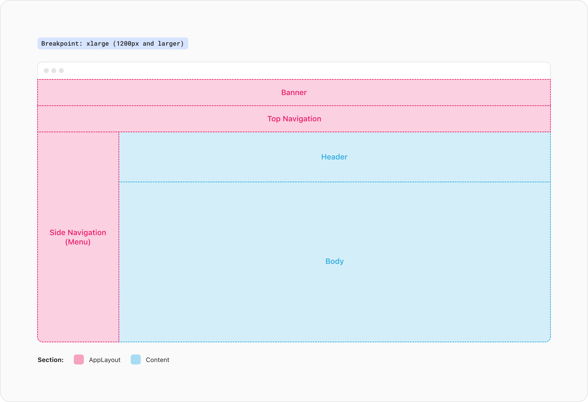
The <AppLayout /> component provides a very simple and accessible structure for your web application's layout. It is designed to be the direct child of the <body> tag (after the Core), organizing your content into distinct sections: a <header> for your top navigation, a section for your menu, and a <main> for your primary content. By adhering to semantic HTML5 elements, AppLayout ensures that your application's structure is both easy to maintain and optimized for accessibility.
To make the most of AppLayout, you'll need to apply height: 100% to the <body> tag to ensure proper layout behavior.
The AppLayout includes a topNavigation prop. Use it when you want to display a row which visually sits above all other sections. It’s position is fixed to the top with all content below this container scrolling underneath the Top Navigation.
The AppLayout includes a banner prop that allows you to display important messages, such as system wide notifications or prompts for user action (e.g., accepting cookies). This banner is positioned above the top navigation, ensuring it is prominently displayed to users. Additional details for the banner will be provided in future updates.
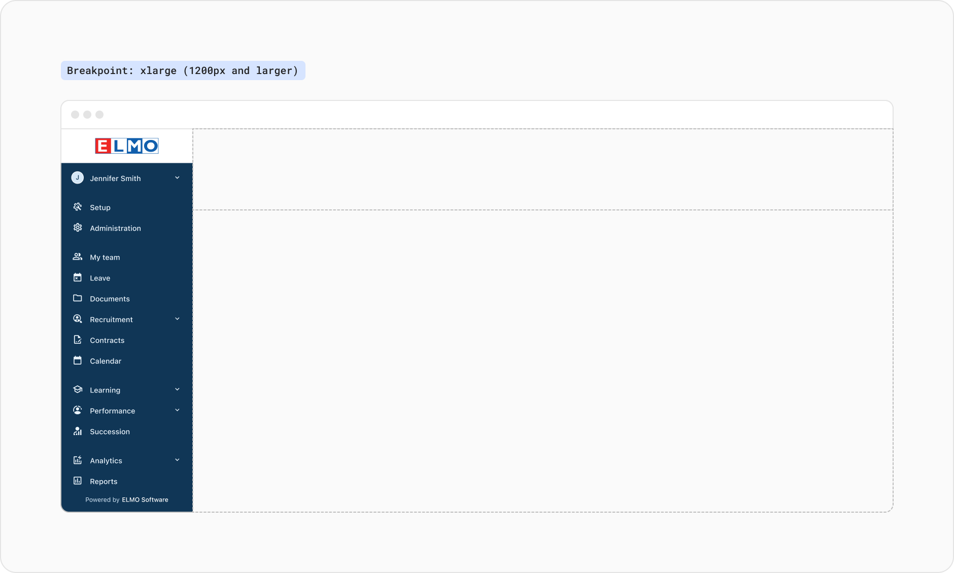
Provide the sideNavigation prop to display the menu which allows users to move between modules or pages. It is always positioned on the far left of the app when displayed.
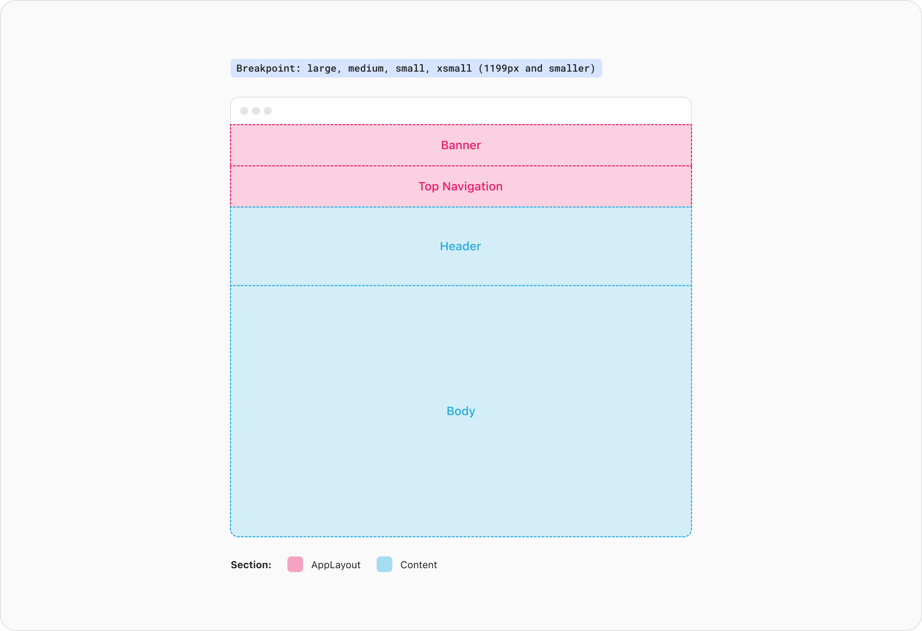
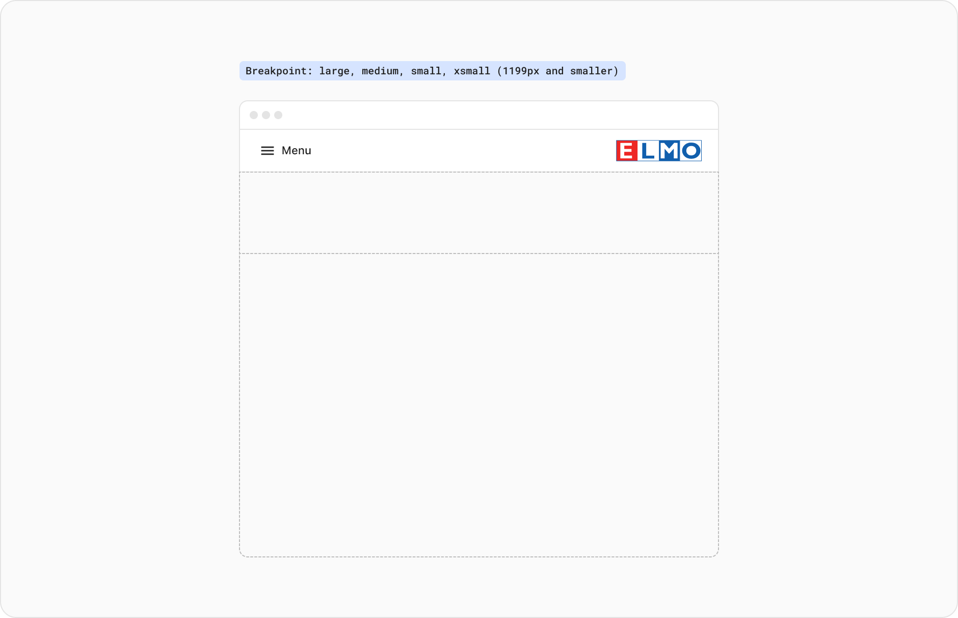
The AppLayout is designed to adapt to different screen sizes seamlessly. When the window size falls below a certain threshold, AppLayout enters a compact state where the side navigation replaces the top navigation, creating a more space-efficient layout.
The side navigation container is removed from the layout when the view is smaller than the xlarge breakpoint. The user will be able to access the app menu as a drawer from within the top navigation when this occurs.
NOTE: You can override the default threshold for the compact state by providing the compactBreakpoint prop. Ideally the AppLayout compact state matches the threshold used by the menu as the menu has its own implementation for tracking compact state.
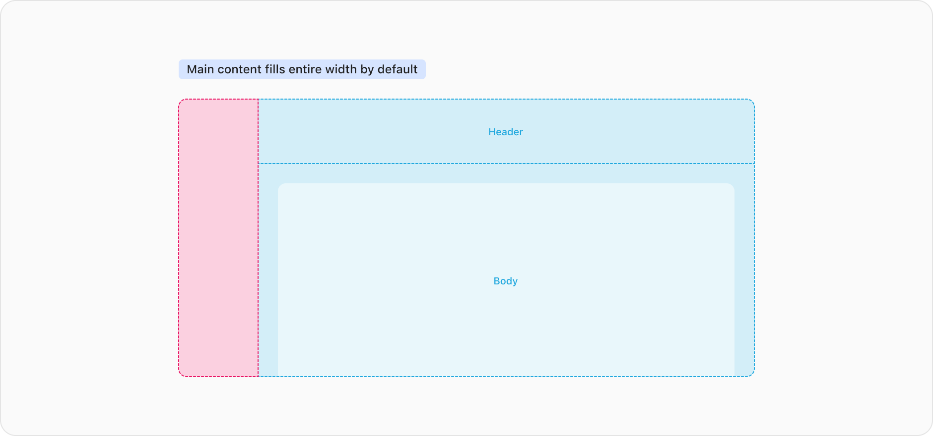
The <Content /> component sets the boundaries of where the main content of the app lives. The content placed within this container expands to fill the entire width of the screen by default. This container has padding values built into it for its responsive breakpoints.
The Content should be a direct child of AppLayout. It sets the correct styles so that the remaining space on the page is used effectively.
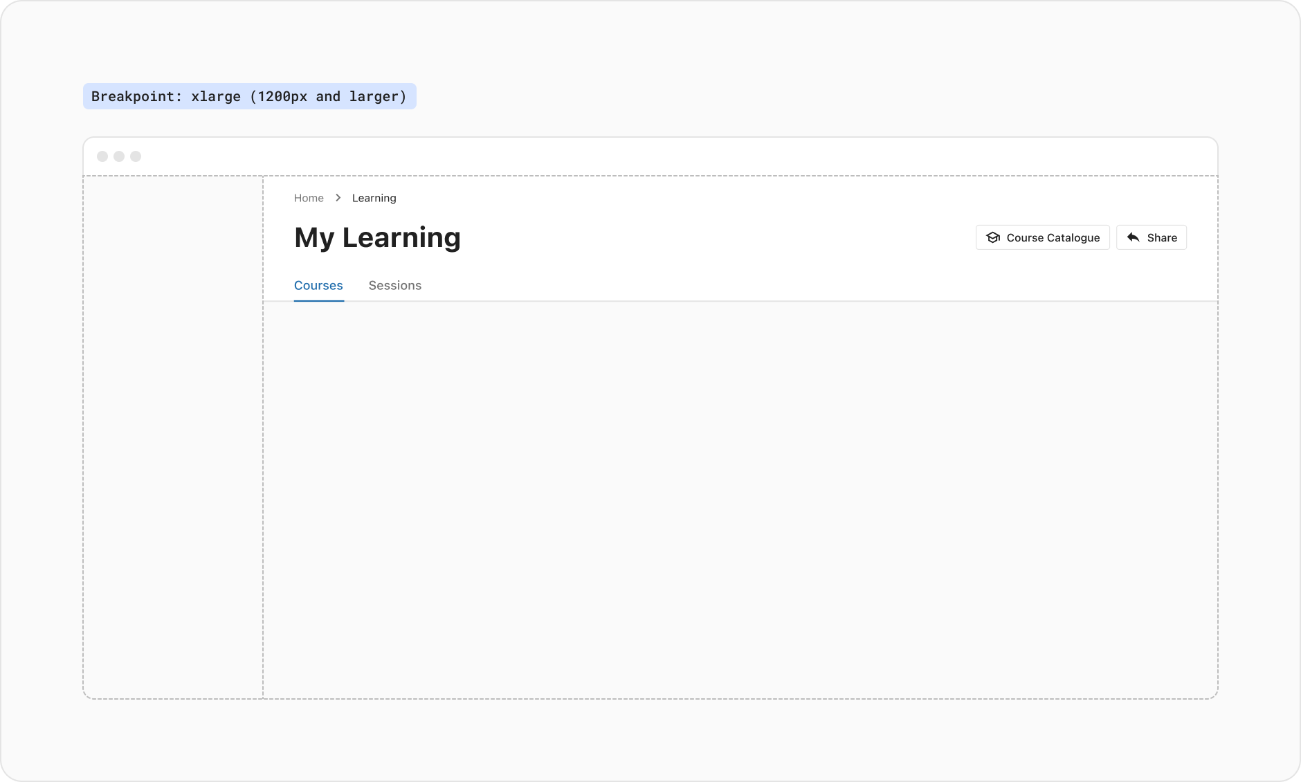
The Content component accepts a header prop and is typically used to display the <PageHeader /> component, but can also accept other custom header layouts such as the doc site header.
NOTE: Content does not set padding for the header because the PageHeader is already opinionated about its own padding.
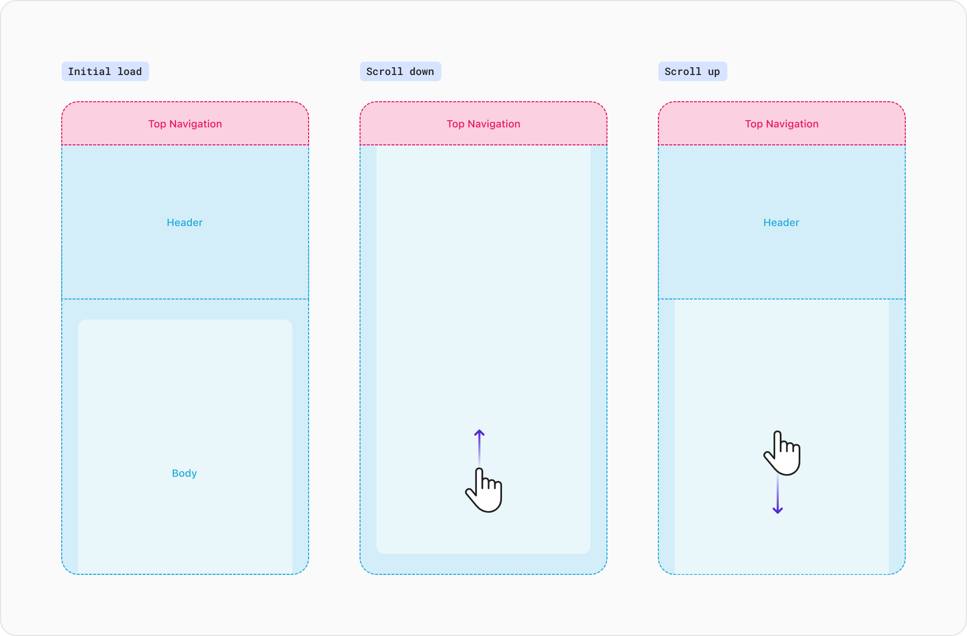
By default, the header does not have fixed or sticky behaviours within the AppLayout. Particularly on smaller screens this may take up a large portion of the users display reducing focus on the page contents and resulting in a less optimised experience.
However, in scenarios where the header container houses important information or actions, the prop stickyHeader can be enabled. This behaviour provides users with access to pertinent functions and removes the need to scroll to the top of the page to view the header container.
NOTE: On both desktop and mobile devices, as the user scroll down the page, the header will naturally move out of view. As the user scrolls up the page, the header container will slide into view.
The size prop allows you to customise the width of the content inside the container regardless of the width of the screen. All content within the body container is justified to the left side by default.
The three available sizes available are small, medium and large. If the view is smaller than the value set by the size, the content will simply fill the available space.
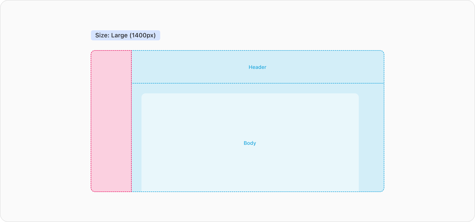
Large has a max-width value of 1400px. This size is suitable for pages with dense UI where we want to restrict the elements from filling the entire view on wider displays. An example of this is applied to our dashboard.
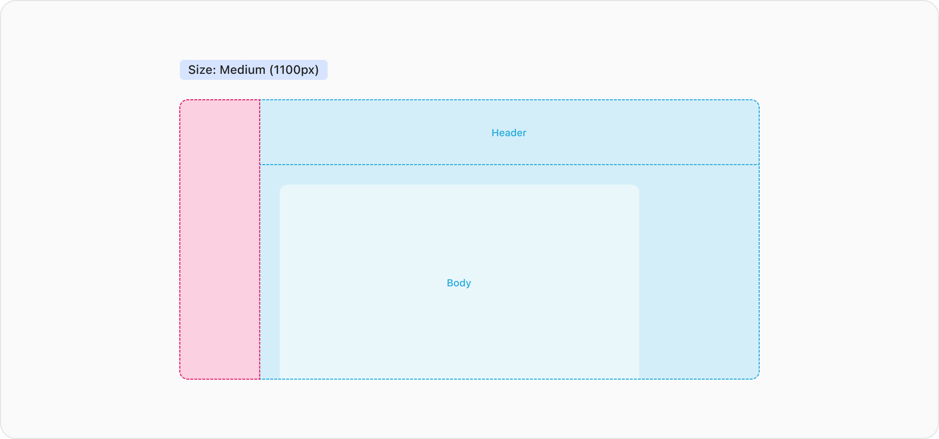
Medium has a max-width value of 1100px. This width is commonly used for forms using the split layout, or for pages which have two columns for content and supporting elements such as our course details page.
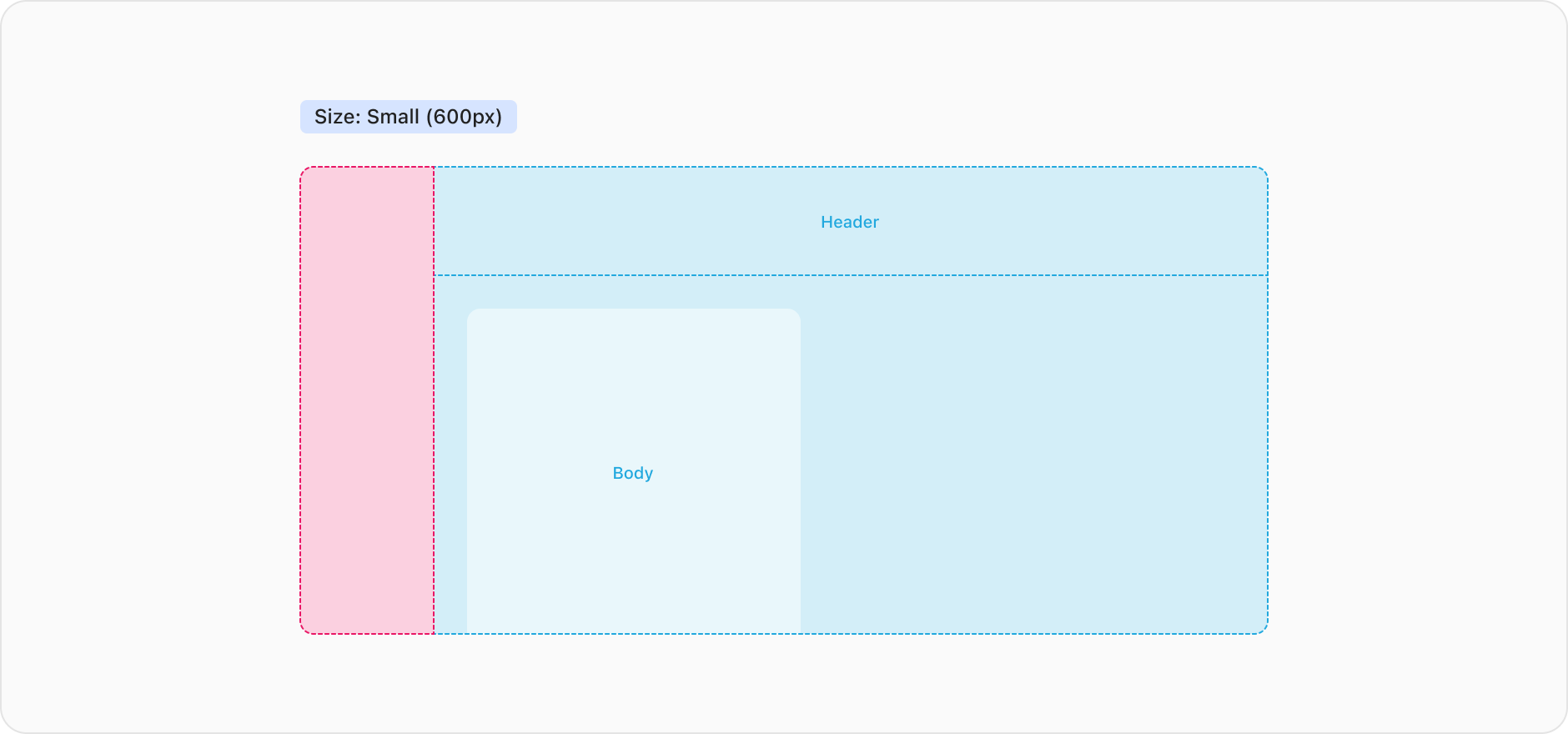
Small has a max-width value of 600px. This width is commonly used for less complex pages or where a very narrow width is required for displaying content.
The align prop allows you to customise the position of the elements within the content container. This is particularly useful along side size, allowing you to customise the area we display content to draw user focus. The two available alignments available are start (default) and center.
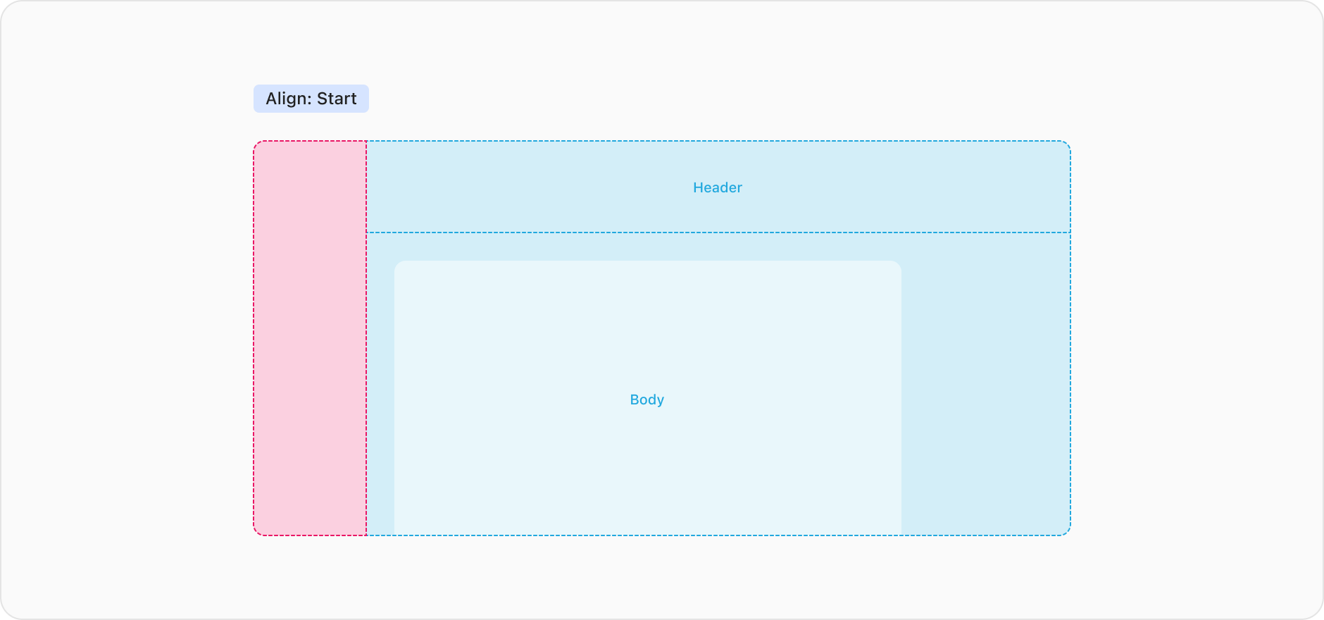
Positions the elements on the far left.
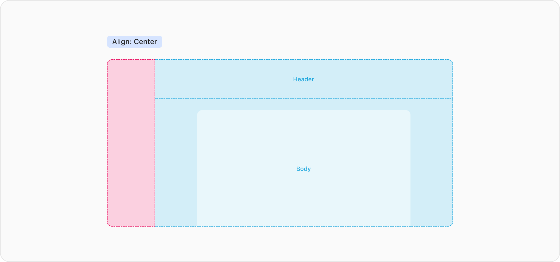
Positions the elements in the middle of the content container.