PageHeader
Helps users understand what the content of the page is about. The PageHeader should always be at the top of a page.The <PageHeader /> component contains breadcrumbs, a heading, a divider, and optional actions. It's ideal for pages with singular actions like adding a new page, editing an existing one, or viewing detailed information.
You can further customise the <PageHeader /> component by adding features to better suit different use-cases. The table below provides more context on when and how to use these customisations:
Properties | When to use |
|---|---|
With actions | Global actions that apply to the entire page can be placed in the PageHeader. To learn more about these actions, refer to the actions guide. |
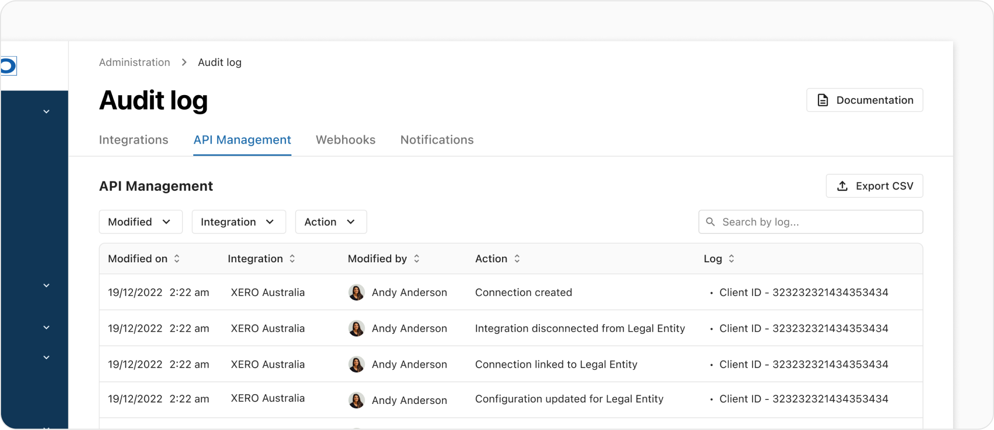
With avatar | Avatars can be paired with the heading for primary elements like user or company profiles. You can add it as contextual info when it is used as a secondary information. |
With contextual info | Contextual information in the PageHeader comprises secondary details such as tags, badges, labels, avatar, links, etc. All contextual items are configured through the contextualItems array. Read contextual info guide for more details. |
With tabs | Tabs allow users to navigate between different views within the same context. Read tabs guide for more details. |
Global actions that apply to the entire page can be placed in the PageHeader. Actions use the <ActionsGroup /> component.
- Only the first 3 actions are rendered - any additional actions are ignored.
- Each action can be either a Button or ActionsDropdown.
- Default actions use the "Neutral tone with left icon button" variant.
- Add new action uses the "Primary tone with left icon button" variant.
- A maximum of one Primary or Critical action can be used.
- Do not use "Ghost button" variant or "Standalone links" as actions.
Contextual information can be incorporated below the heading. This space allows for the utilisation of the elements such as small-sized text, standalone links, link buttons, icons, tags, badges, or avatars, depending on the specific use case.
Badges can be used to convey status, while tags are used to highlight the most pertinent information. Each contextual item supports different variants and can be combined to create rich contextual information using the contextualItems array.
- Do not use more than one tag or badge in the contextual info.
- When using multiple "Link" or "Text" contextual info, ensure consistency by choosing any one of the following formats: Label & Link/Value, Icon & Link/Value, or Link only/Value only. Do not mix different formats within the same PageHeader.
- Icons should only be used when it is adding essential value and having a strong association with the label. Icons should not be used just as decoration. Moreover, avoid mixing text-only labels and icon-only labels within the same group to prevent unnecessary clutter and ensure ease of information scanning.
The PageHeader includes support for navigational tabs. Enable this functionality by passing an array of NavigationalTabItemProps from Tabs as tabs.
When tabs are used, the layout spans the entire width of the container. The divider extends from the left edge to the right edge of the container.
When adding a new page/record, the PageHeader should display the appropriate heading to indicate the action being taken. The heading will be "Add," followed by the specific page/record name. For instance, if you're adding a new category, the heading should display "Add category." If you're adding a new external training entry, it should read "Add external training." This ensures clarity for users regarding the type of content they are creating.
If the page is for viewing or editing purposes, do not add "Edit" in the heading. The heading will be the category name, for example, "Alpha accreditation program," as shown below.