Toast
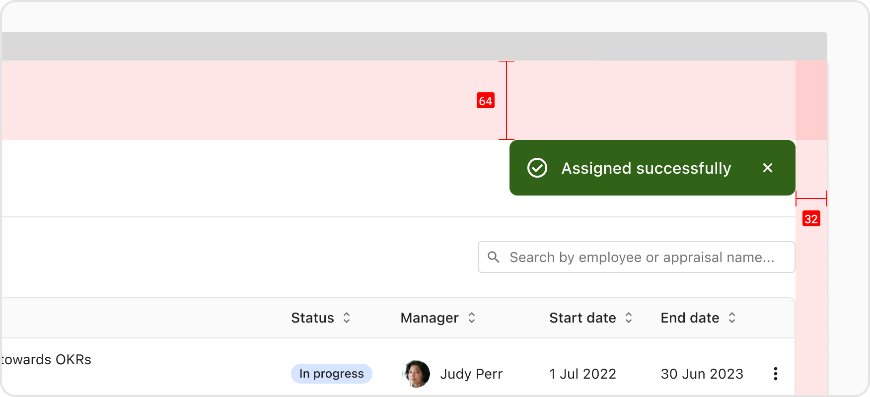
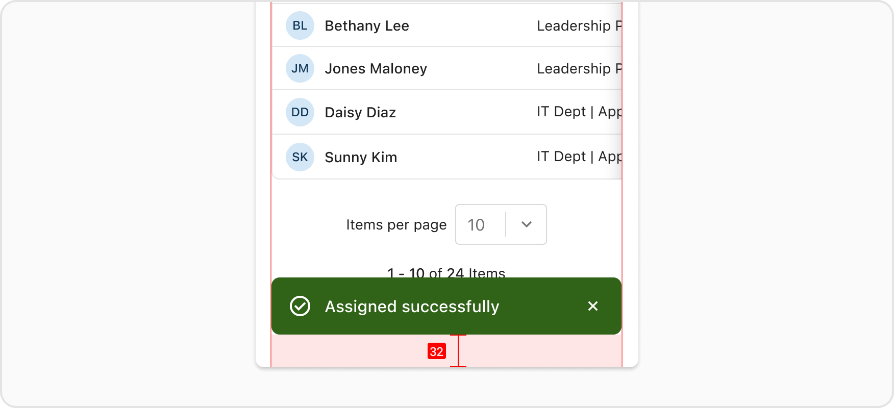
A brief notification that doesn't disrupt or require an action.Toasts display temporary feedback notifications at the top right of the user's screen. They are meant to be noticed without disrupting a user's experience or requiring an action to be taken.
First, render the <Toaster /> component in your app root:
Then use the toast object to show toasts:
Typically a toast will be initiated in response to an action or completed API request, but for the purposes of demonstration, all toasts in this documentation are triggered via a button.
Use toast.success() for successful actions and toast.error() for errors.
In small viewports (>= 576px), toast notifications slide in and out from the top right of the screen, with xsmall space (0.5rem/8px) between each. New toast notifications should appear at the top of the list, with older notifications being pushed down until they are dismissed.
In xsmall viewports (< 576px), the toast notifications slide in and out from the bottom center of the screen.
Toaster have a minWidth of 16rem/256px and maxWidth of 25rem/400px.
In xsmall viewports, the width of the modal will consume 100% of the container with a 1rem/16px margin on each side.
A message is required in order to render a toast. Messages should be strings. It's best to keep messages succinct.
By default, the toast comes with a "dismiss" button in the form of a close icon. You can optionally add an action button which requires buttonText and onClickButton props to be set. Also available is a link which requires both a linkText and linkHref.
Link action should be used when the action takes user to another page. Button action should be used in all other scenarios (eg. undoing of the toast action, activating a modal, etc)
Toasts are set to auto-dismiss after 5 seconds by default, but hovering over a toast prevents this automatic dismissal. Alternatively, users can simply click the close icon to dismiss the toast instantly.
The <Toast /> component and toastMessage function are deprecated and will be removed in a future version.
Deprecated:
Recommended: