Filtering
Apply attributes via a set of controls to reduce the data presented to the user.Filtering enables a user to narrow down a large data set by applying one or many attributes to a set of controls, each tied to an API endpoint. When applied, the UI is updated to display results matching the selected attributes. A consistent filtering experience between apps helps users discover what they are looking for, faster and with ease.
Before designing, it is important to consider the following points:
-
What is your data made of? Understanding what data is available will help guide in choosing the UI that is most suitable to present the data. Commonly we present data in tables, but this can vary significantly.
-
Mirroring data. It's recommended for filter controls to mirror the data displayed, enabling users to narrow down by all the individual attributes presented to them.
There are three levels of complexity for filtering in EDS:
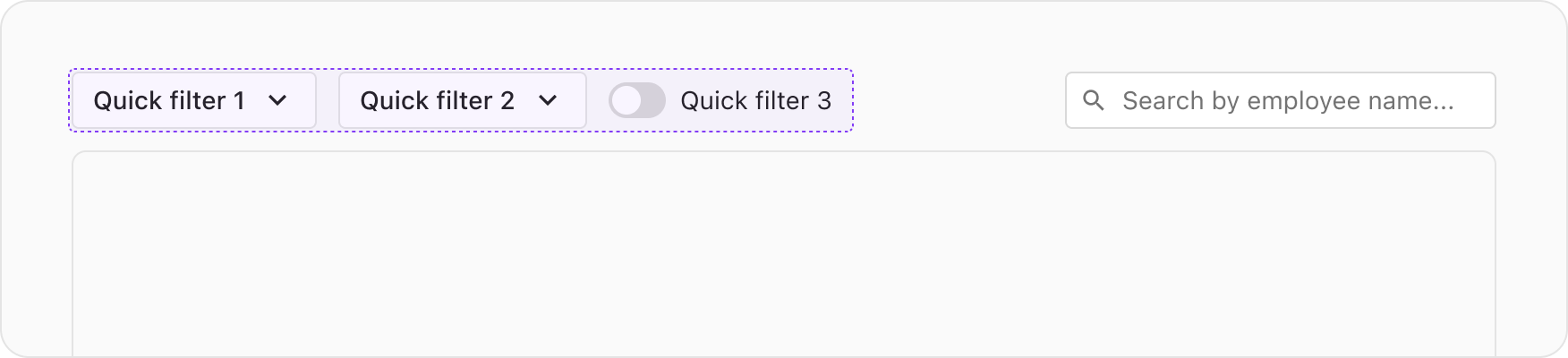
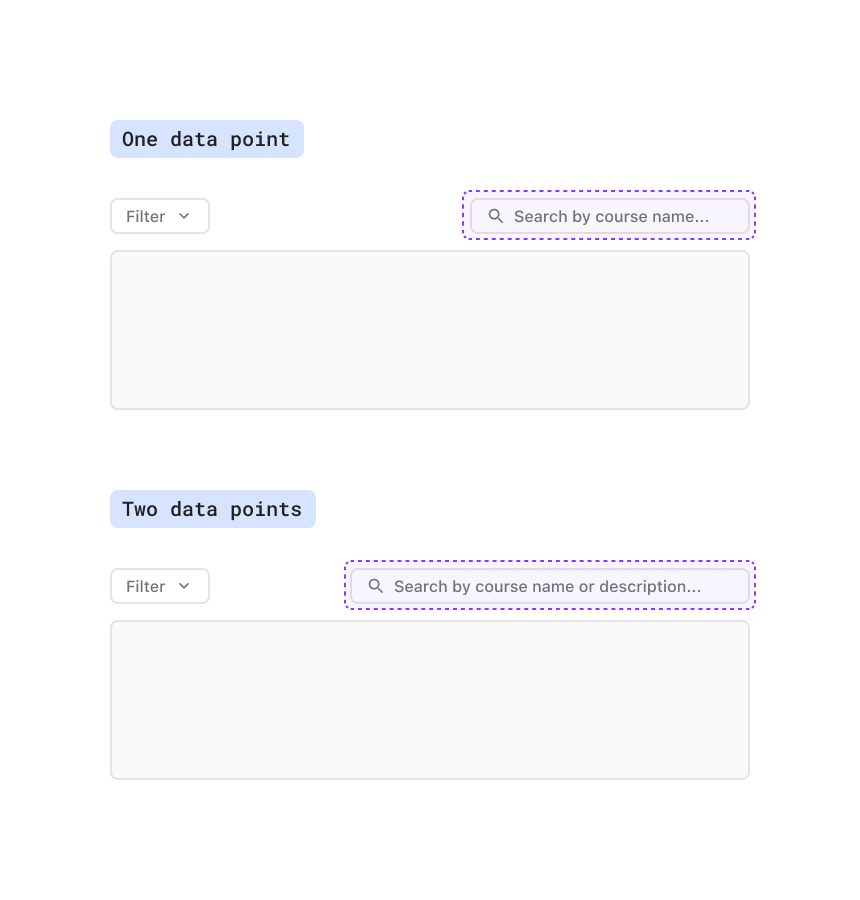
- Quick filters: Use when you have 3 or fewer data points
- Advanced filters: Use when you have more than 3 data points
- Saving and managing filters
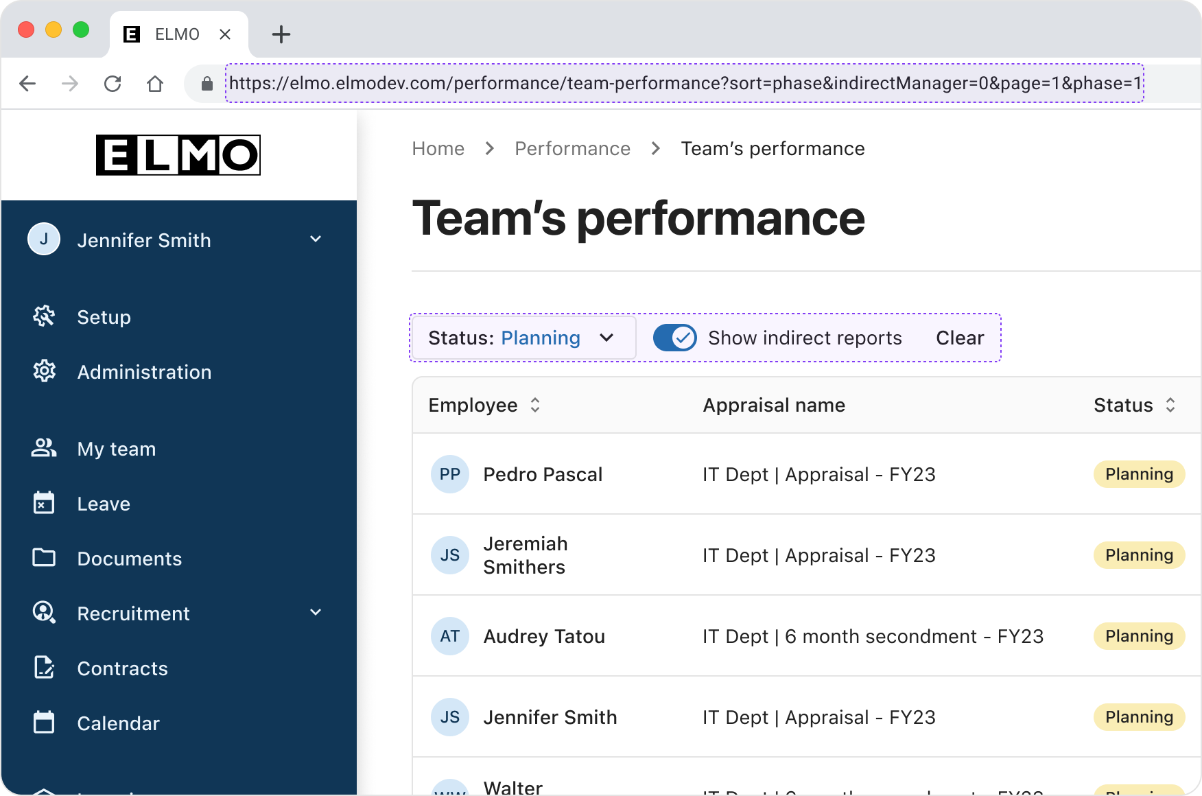
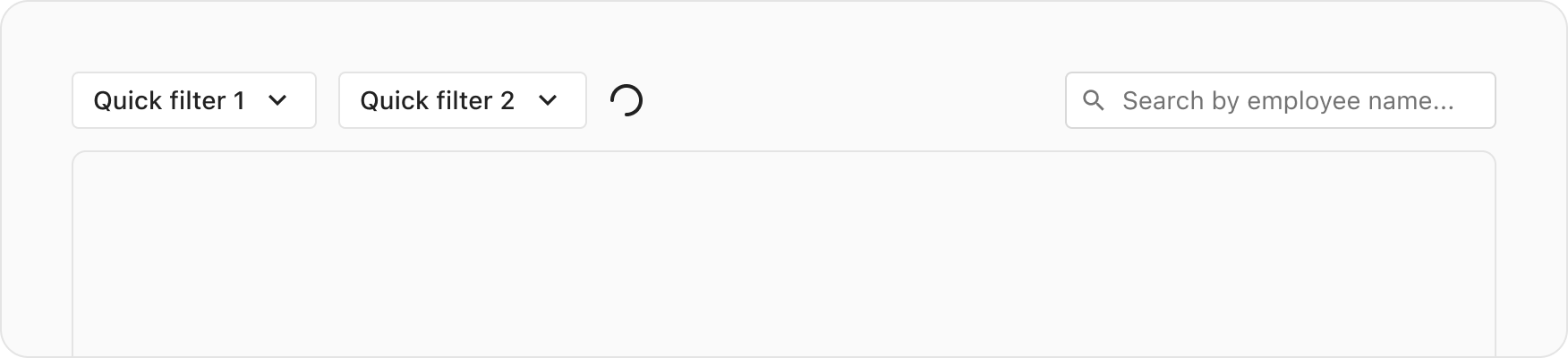
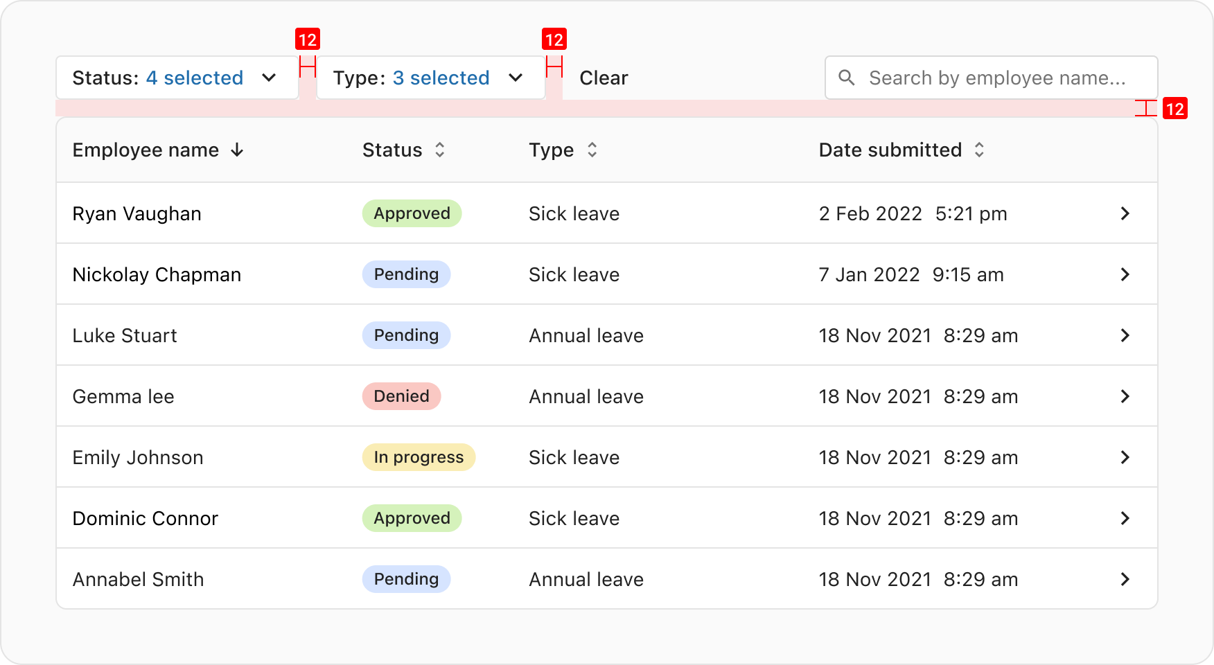
Quick filters are filter controls that are immediately accessible to the user. They are positioned at the start of the filter bar, and should update the UI instantly after a selection is made.
Ensure that the horizontal space is sufficient to contain the following elements on a single row when viewport width is above the large breakpoint:
- Max 3 filter controls.
- A "Clear" button, displayed when at least one filter is applied.
- A loading spinner, used to indicate that filtered data is being fetched.
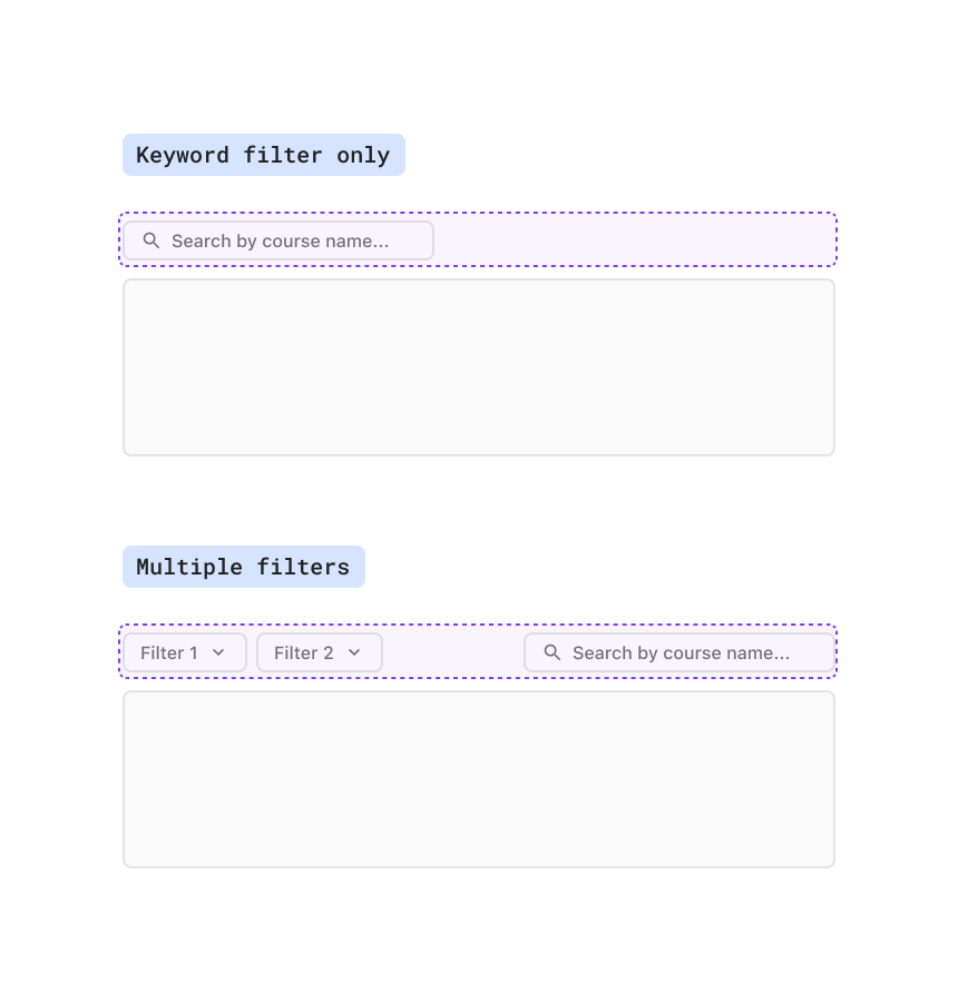
- A search input for filtering data by keyword.
See Filter controls for a list of components that can be used.
NOTE: The keyword filter is technically a quick filter but has different positioning guidelines.
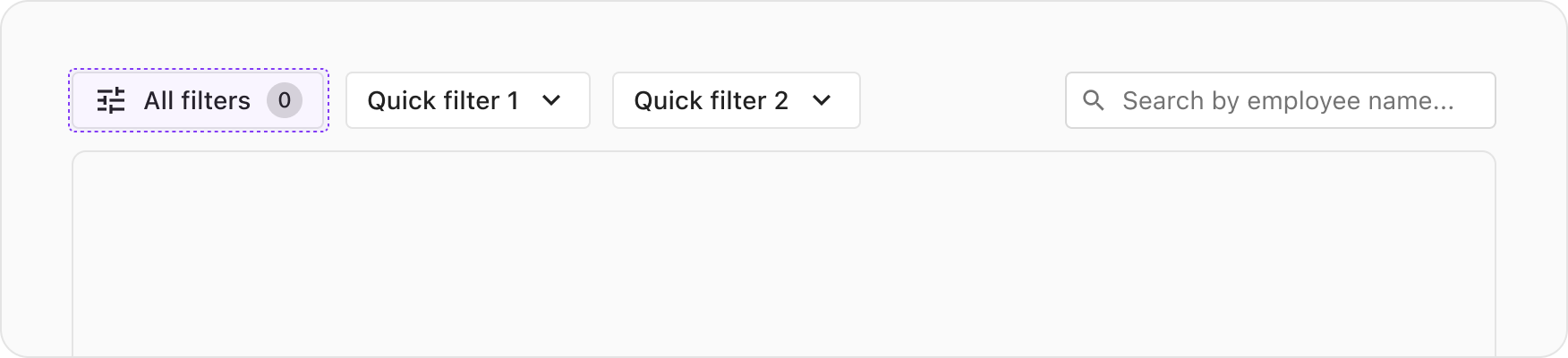
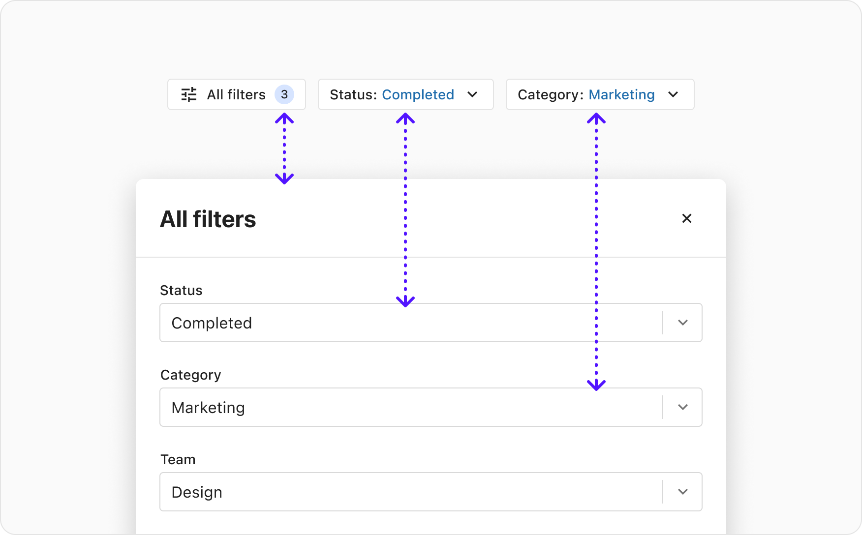
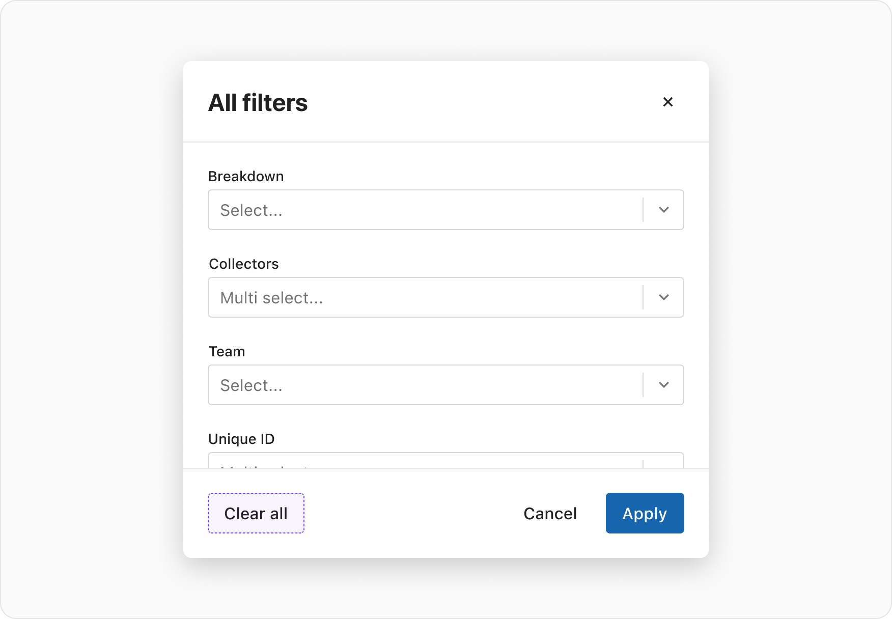
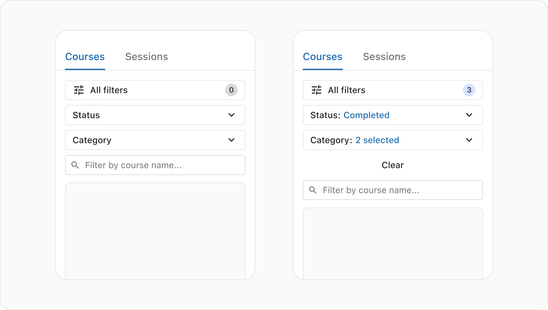
When offering to filter on more than 3 data points, it's recommended to house all available filters in a modal. This includes all quick filters (excl. the keyword filter).
This provides the ability to set multiple filter and apply them all in one go.
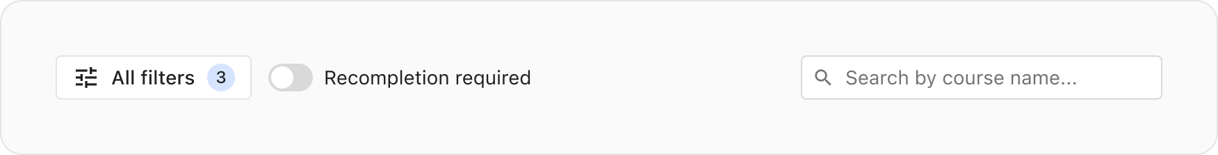
For easy access and overview, place an AllFiltersButton as the first control in the filter bar and provide the total number of applied filters. For the most used or important filters, you can combine the "All filters" button with max 2 quick filters in the filter bar.
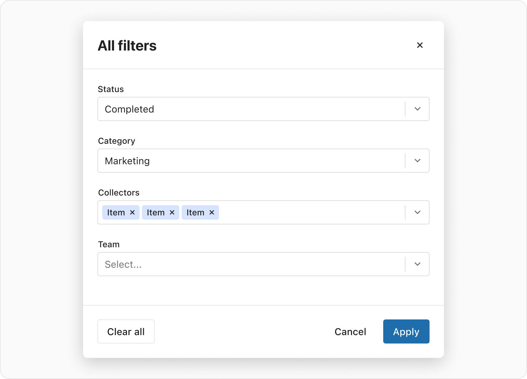
The button opens an "All filters" modal, comprised of a ContentModal containing a form input for each available data point, as well as actions the user can take; "Clear all", "Cancel" and "Apply". After selecting the desired values, the user presses the "Apply" button to apply the filters selected.
Any quick filters presented in the filter bar are also included in the modal. If they are applied from within the modal their selected values are reflected in the quick filter controls and vice versa.
The ability to save, manage and apply sets of filters is ideal for highly complex data, power user scenarios, or for filtering experiences where returning to a customised view of a data set is desired.
When an attribute is applied a loading spinner appears in the filter bar, to notify the user that filtering is in progress. As soon as the data has been fetched, the loading spinner disappears, and the UI is updated with the filtered results.
The positioning of the loading spinner in the filter bar is important, as to not cover the current data in the table below, but also for visual proximity to the filter control that the user just triggered ("All filters" button, a quick filter control or the "Clear" button).
When the user has applied filters which render no results, the empty state component is presented below the filter bar. The empty state provides context to the user that the filters are producing no results.
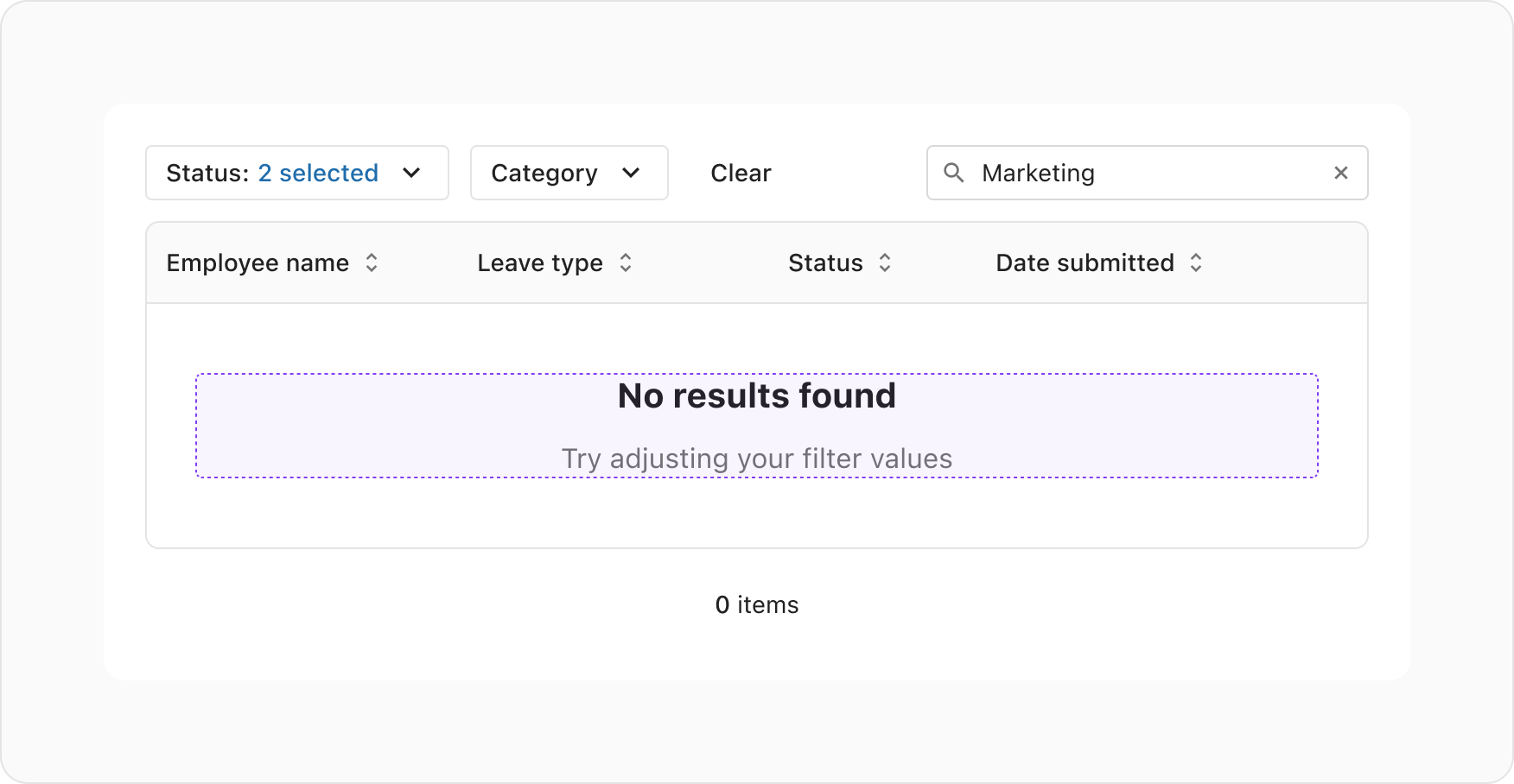
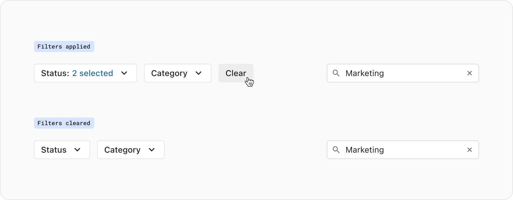
Whenever one or more filters are applied, a “Clear” button is presented in the filter bar. Pressing this button clears all filter values, removes the button itself, and displays the now unfiltered data results in the UI.
In the "All filters" modal, the “Clear all” action is positioned in the footer to the left side. Pressing this button clears all the form inputs and keeps the modal open. The user can press the "Apply" button to commit the cleared filters and close the modal, after which the UI is updated with the unfiltered data.
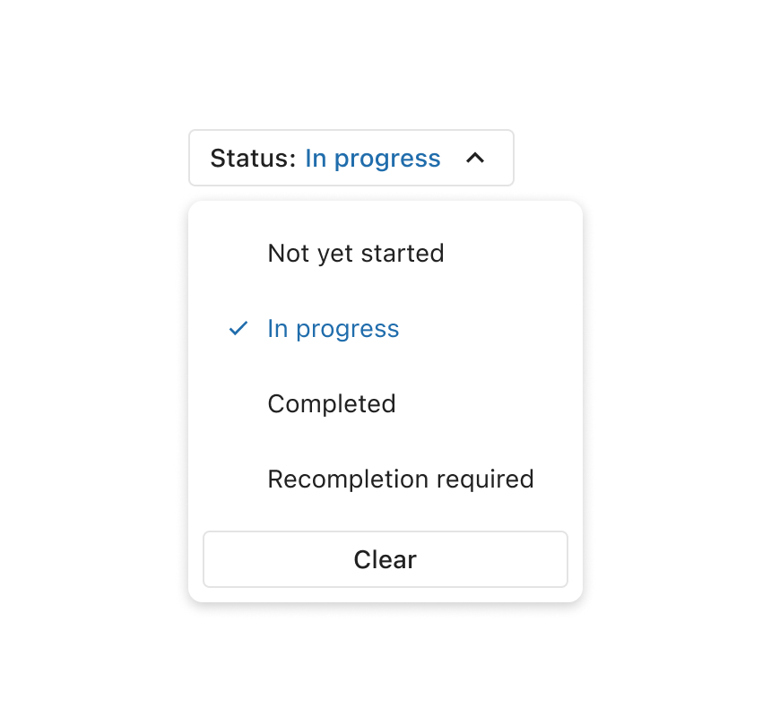
NOTE: Some filter controls have the ability to be cleared independently, such as the Select dropdown and the Keyword filter. It's recommended to always include this functionality in addition to above when implementing filtering.
When composing filters you may require a variety of controls depending on the data presented to the user. This section breaks down what components are commonly used, and how to best use them.
The keyword filter uses the SearchInput component. It dynamically requests results as the user types into the input, with no other action required to apply.
The keyword filter is typically tied to the first item in a data table, or the ‘primary’ data point (in a data set). It’s also common to tie it to two data points. This could include a primary data point such as ‘Title’, and a secondary data point such as ‘Description’.
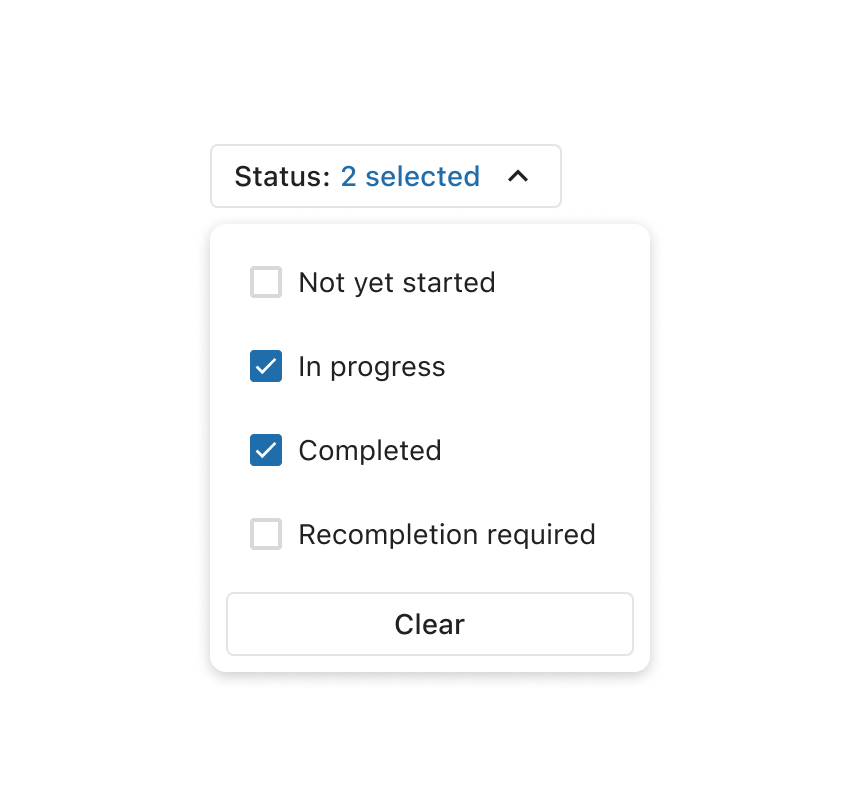
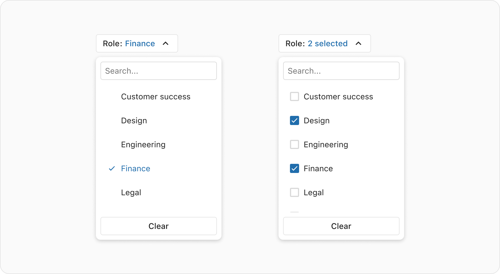
The SelectDropdown component is the most common filter control, and allows the user to select one or multiple values from a list.
When building filters, it's recommended to use the default trigger button that the dropdown comes with out-of-the-box. This displays the selected value in the button label, or a total count if multiple selections are made.
When there are 10 or more options in the list, it's recommended to provide a search in the dropdown. This helps users narrow down the available options.
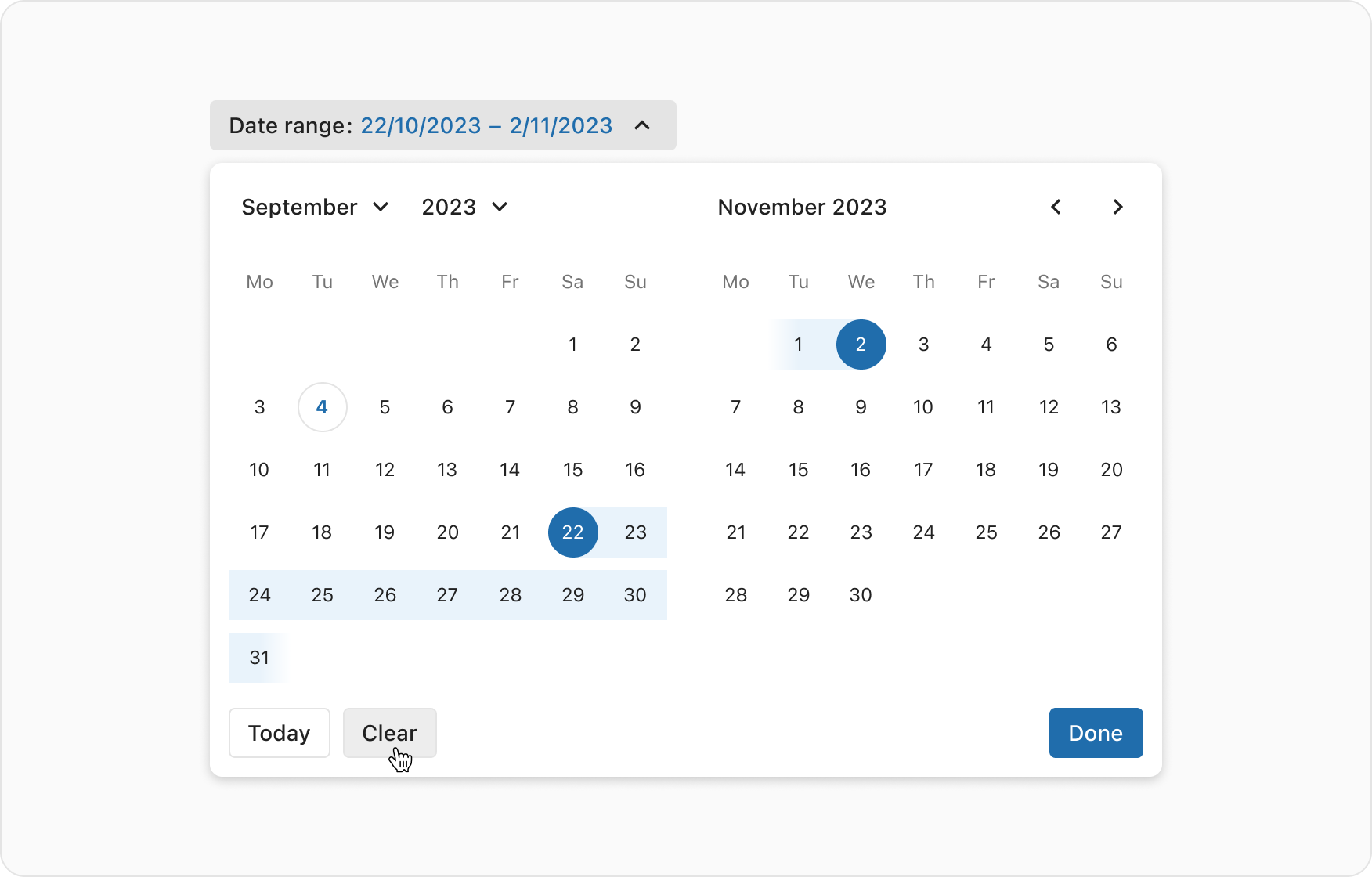
The DateDropdown component allows users to filter for a range between a start and end date. Once the user has selected a range, the results will be fetched and applied. The overlay closes when the user presses "Done", clicks outside the overlay, or ESC via keyboard.
Selecting a start date will auto-set the end date to the same date until the user selects their desired end date.
When the filtering experience offers a user a boolean option (true or false), a Toggle component can be used in the filter bar.
The spacing between elements of the filter bar uses the Small (0.75rem/12px) space token, and the spacing between the filter bar and the filtered results (commonly a table) is also Small.
In smaller viewports, or when the filter controls can no longer fit horizontally in their container, they are stacked vertically with a gap of xsmall (0.5rem/8px) space token.
Depending on the use case, filter controls can have values pre-applied on initial load of a page. This offers the user a defined set of results which can be cleared or refined further. Carefully consider the following before implementing:
- Using pre-applied filters should be grounded in a solid understanding of user needs and behaviour, with the team accurately comprehending user preferences. If incorrect assumptions are made, users might be presented with data that is not immediately useful to them.
- A "Clear" button must be presented in the UI, allowing users to remove pre-applied filters.
If the URL parameters reflect what filters are applied, the filter controls are populated with the parameter attributes and the results will be fetched and displayed in the UI on initial load.