Forms
A form is a group of related inputs which guide users with ease to submit data or configure options.Forms are a very common pattern for users, so consistency is fundamental. When designing forms carefully consider the structure, actions, field labels, accessibility and feedback to help a user successfully submit the form.
To ensure users can scan and complete forms effectively, consider the following:
- Only ask for information that is absolutely necessary.
- Use the <Fieldset /> component when grouping related tasks to provide context and easier scanning of forms.
- Carefully consider the width of the form on a full page to ease progression and scanning.
- As much as possible, keep forms to a single column. Multiple columns can lead to disruptive scanning for the user. Fields with similar themes can be placed on a single line such as; ‘First name’ and ‘Last name’ or ‘State’ and ‘Postcode’.
Forms are comprised of some or all of the following elements.
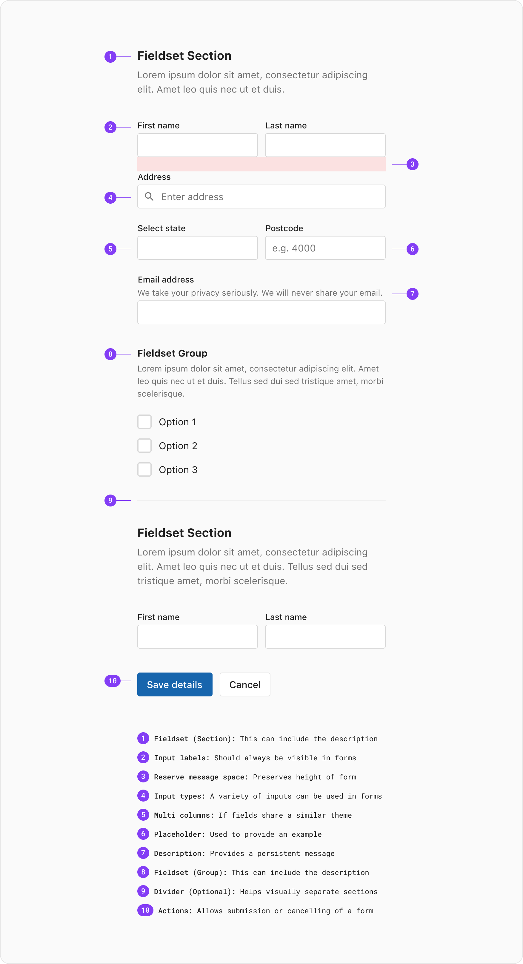
Used to mark a field as mandatory to complete before submitting a form. When building a form its recommended to provide a legend above the fields which denotes the meaning of the * symbol.
Use a primary or critical button as the main action in a form. A secondary action can be added using either the neutral or ghost options for actions like ‘Cancel’ or ‘Discard’.
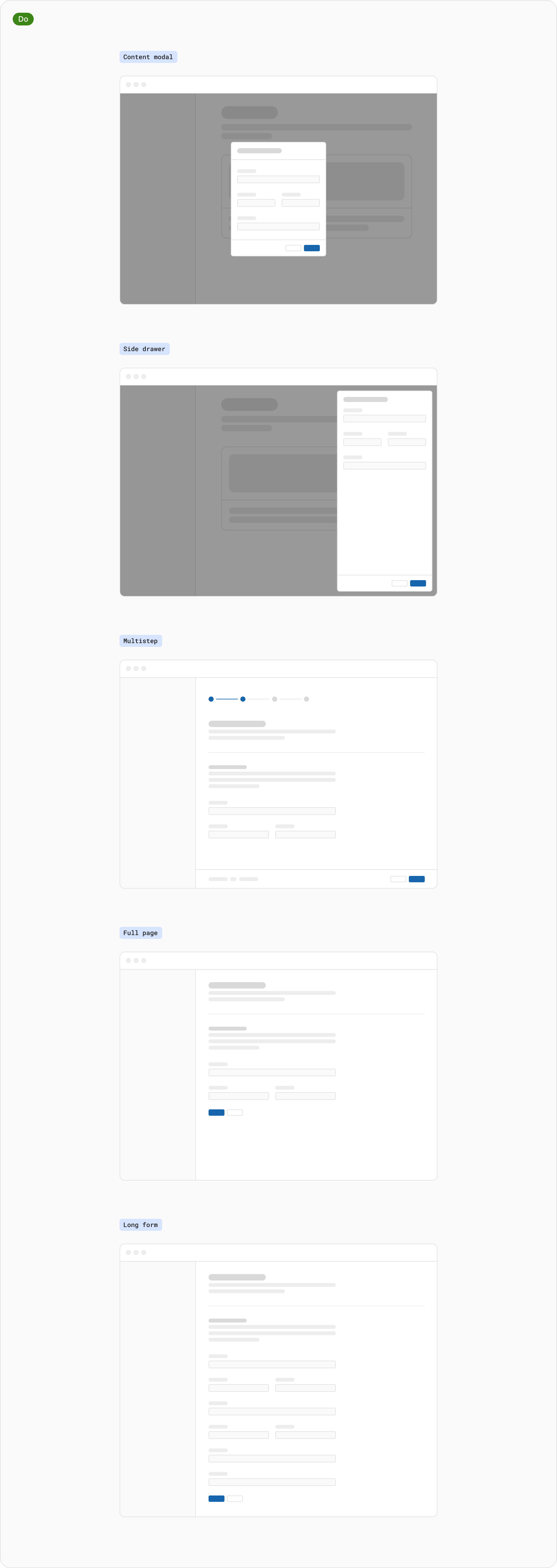
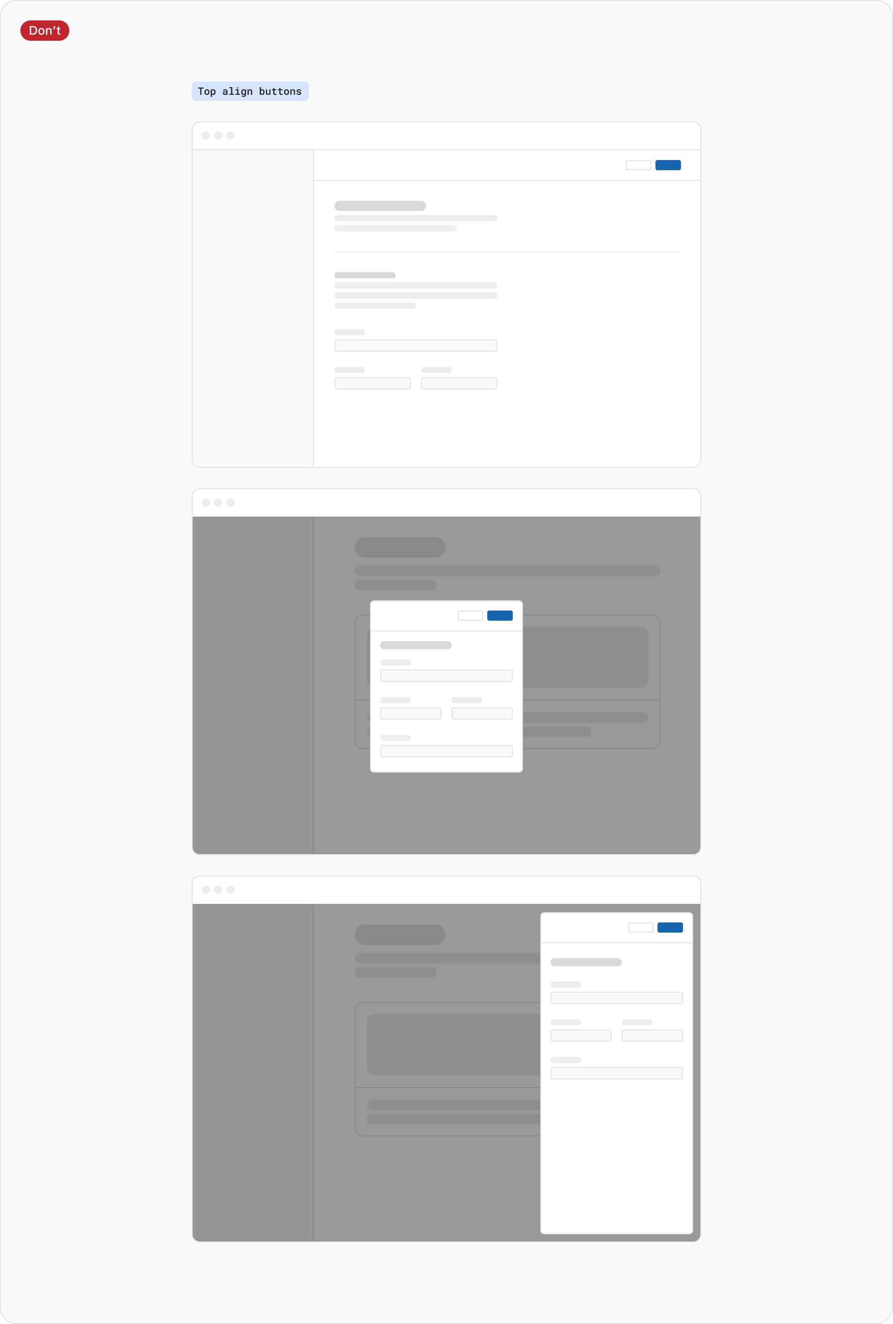
Positioning refers to the order and alignment of buttons in a container or layout. Depending on the type of form being built, this will determine the button positioning used.
-
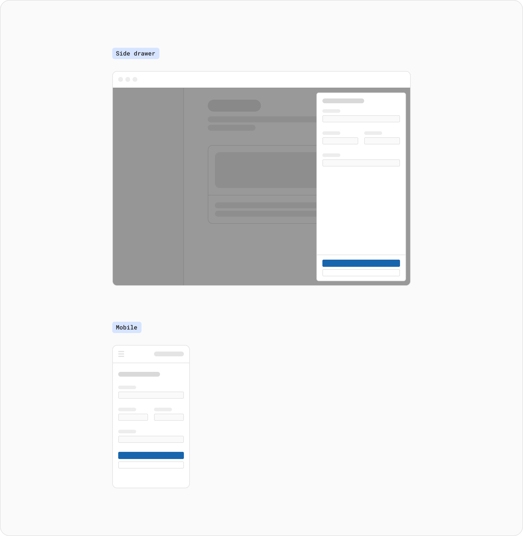
For modal dialog, side panel, multistep forms, a right alignment is used. The buttons are sorted by importance from right to left and positioned on the right side of the form. This positioning is used in circumstances where the user is being queued to progress forward, or has been displaced from the base level of UI.
-
An exception to this are full page or long forms which should be left aligned. The buttons are sorted by importance from left to right and positioned on the left side of the form. The reason for this exception is to reduce fatigue by keeping the alignment consistent with natural left to right scanning.
If a buttons contents is too long to fit inside the available space of a container, stacking buttons vertically with the primary action above the secondary action is the recommended option. This is also common for mobile experiences where the available width can often be an issue.
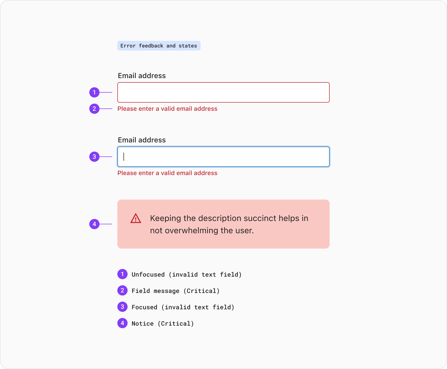
Validation and error messages are used to indicate when a form submission or field is invalid. These errors require additional actions from the user to submit successfully. Both the notice component and field validation can be used when informing the user of what has happened.
In most cases validating user data before form submission is recommended. Having fields validated in this way helps to easily identify the elements that need to be corrected as the user progresses through the form. A field becomes invalid once the user exits focus, having a field become invalid during completion can be jarring for the user
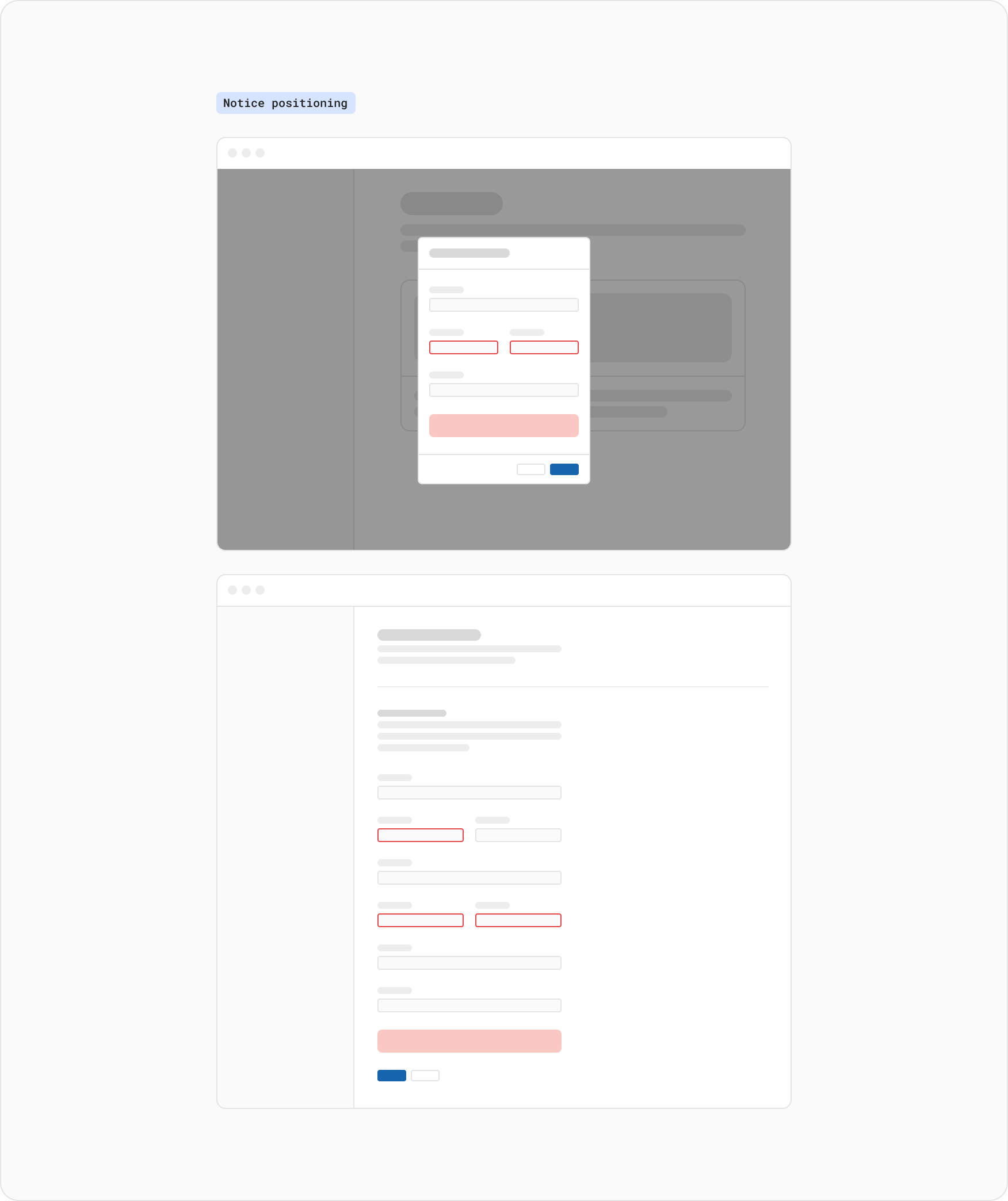
When the user submits a form the page will render the detected errors. This is where a notice and additional validation on fields can be applied. When the user corrects an error in a field the error message and critical input state will be removed when possible.
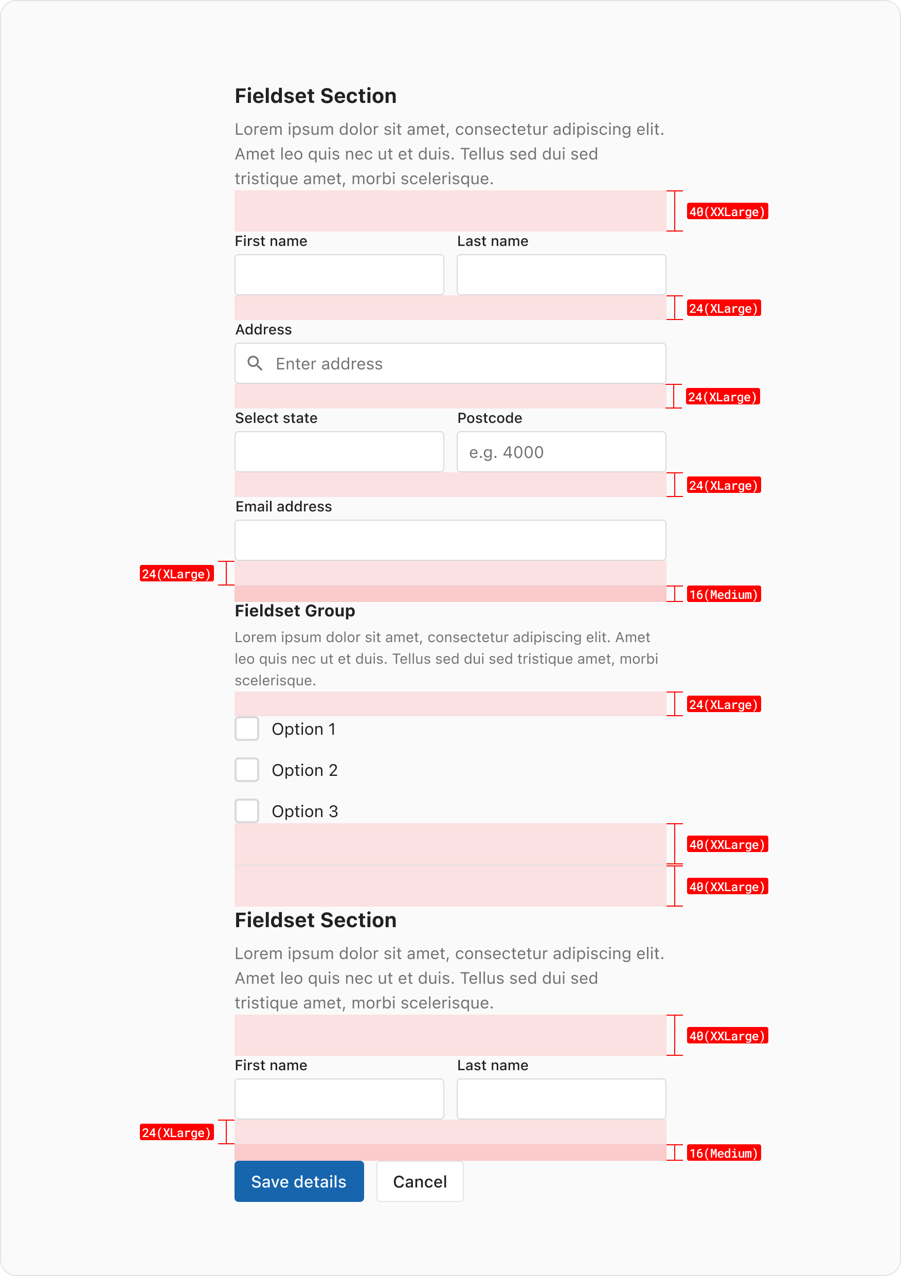
The space between the Fieldset(Section)/Legend and the form fields is set to the XXLarge (2.5rem/40px) space token. The same goes for the end of a form, a overall spacing of 40px (including the reserved message space and the medium space token) between the forms fields and the buttons should be used.
For forms that live inside the body of a component such as a modal dialog or side panel the spacing above and below the fields should use the spacing defined by the component. For example, 24px is the recommended padding left/right and top/bottom for a modal dialog.
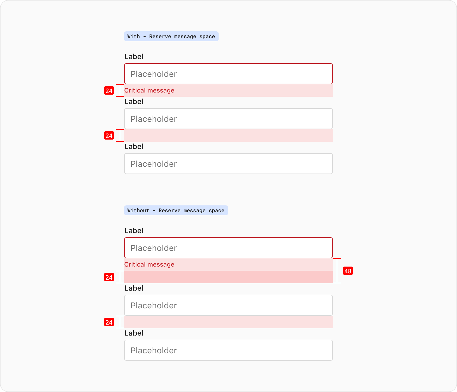
Reserves the vertical space that will be taken by a message. You would use this to stop subsequent elements from being pushed down when a message is displayed. This should be commonly used whenever building forms.
Reserve message space should only be avoided for really short forms or for forms with a single field element, for example: an email field at the bottom of a page to sign up to a newsletter.
When stacking fields with ‘Reserve message space’, the padding below the field is already applied to the component which is set to 24px. The inputs can stack with no spacing applied to the auto-layout in this circumstance.
To help build consistency around form widths it’s recommended to not exceed 480px. For forms which appear in a container or component such as a ‘Modal dialog’, the widths are handled by the set size and padding of that composition.
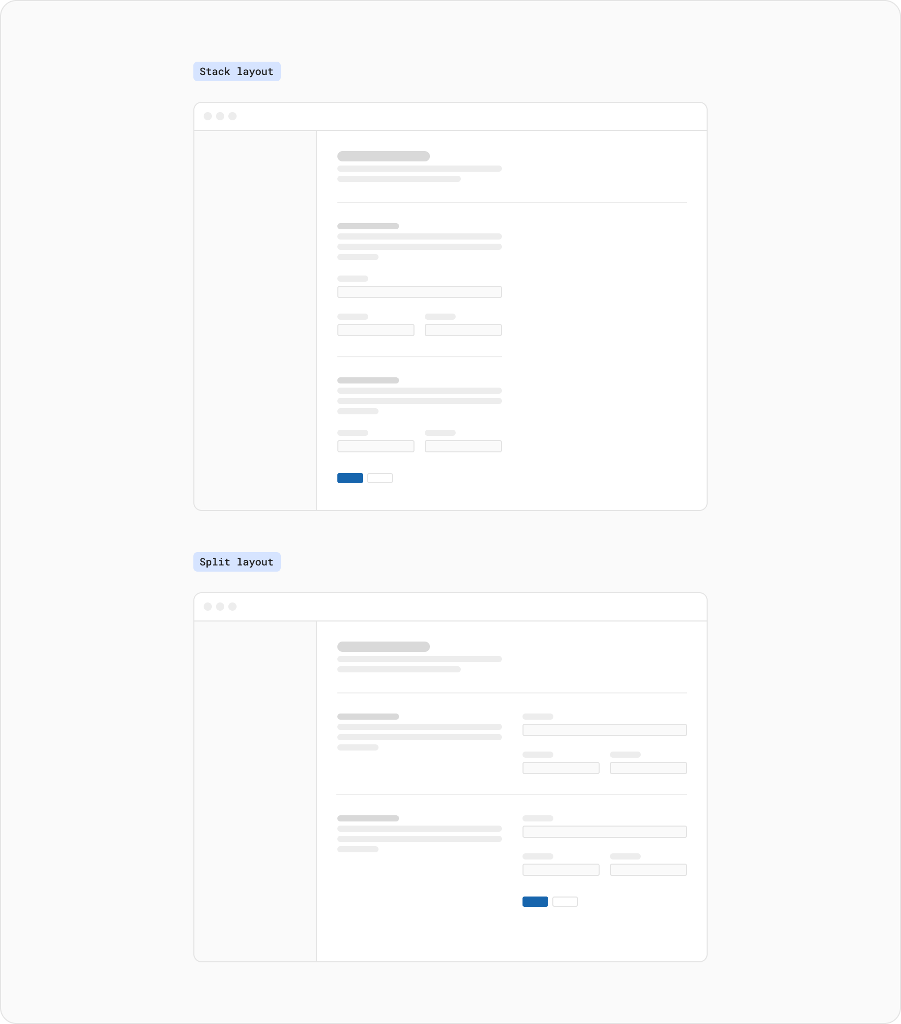
When building a form in full page layout the fields can be either stacked or split (placing the ‘Fieldset Section’ on the left of the fields). When building a ‘split form’ this layout uses the XXL space token (40px) between the columns.
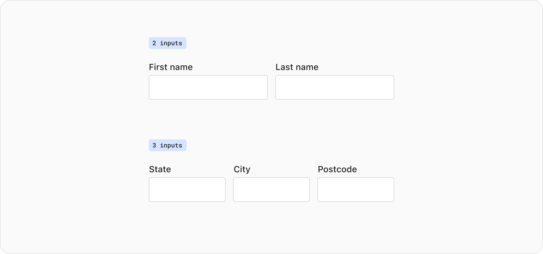
When grouping related fields horizontally ensure they are thematically similar. When two or three inputs are placed on a single line having them related by a theme will help reduce any confusion and improve scanning, some examples of this include:
- first name and last name
- city, state, and postcode
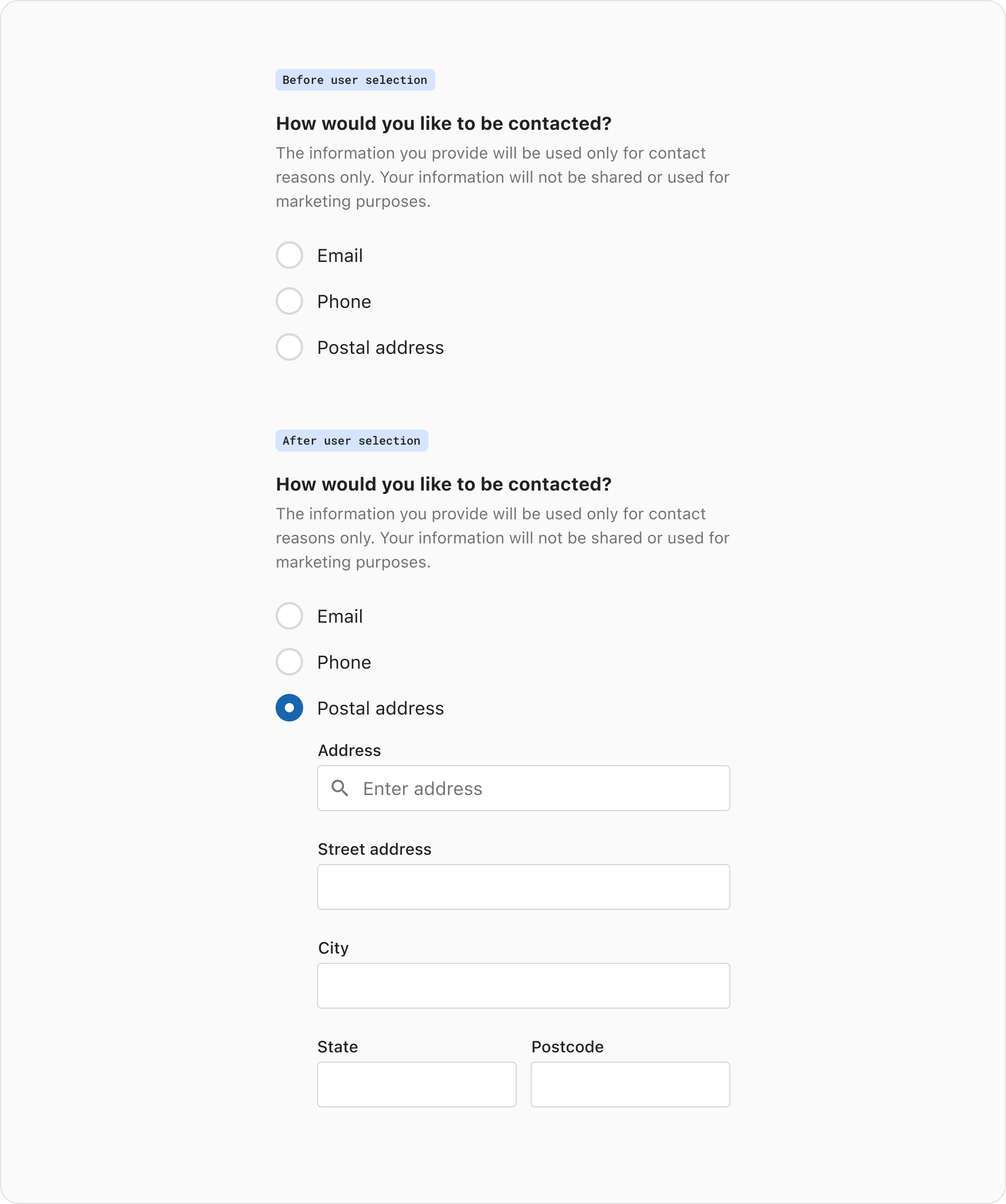
This approach is used to progressively reveal form elements which become necessary only after the user has selected an option. Common controls which can trigger this behaviour include, radios, checkboxes and select inputs. Progressive disclosure can help control the pace and cognitive load required by the user, while reducing time spent in a form by avoiding unnecessary field completion.