Tables
Tables are used to display and organise large data sets.A table is a very common pattern when you need to display large data sets. To make it easier for the user to find and manage these sets it’s also common to compose tables together with other related components to create more advanced experiences.
Tables can be composed together with the following components as needed.
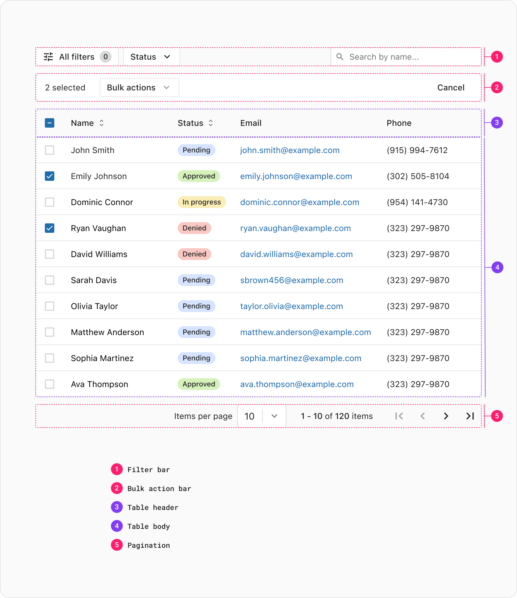
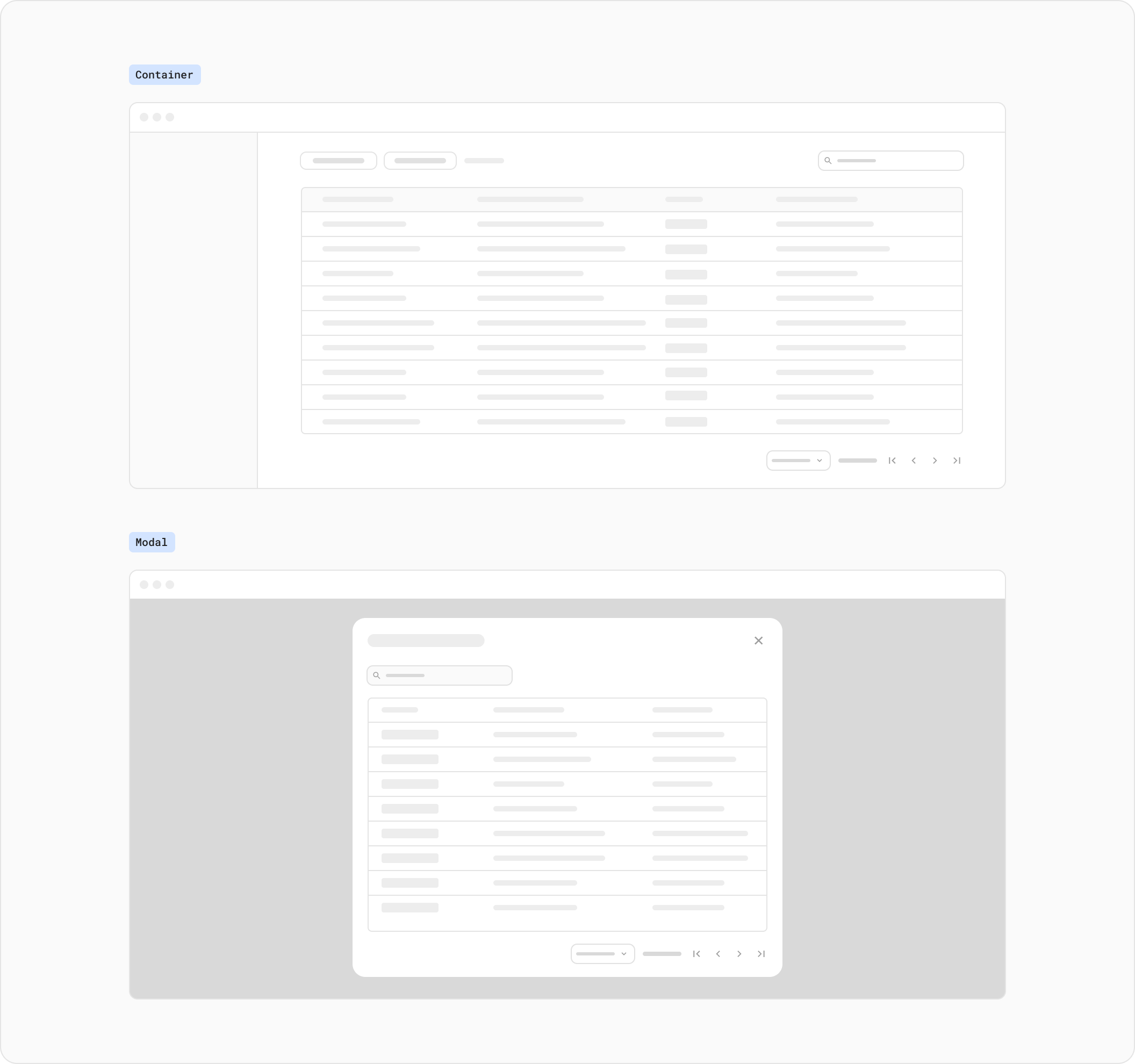
Tables should always be full-width, extending to the edges of the available space in the layout container, including within modal components. This approach ensures that tables utilises the entire width of the screen, maximising the display area for tabular data. By filling the available space, tables can accommodate a larger number of columns and provide clearer visibility for content. Additionally, maintaining consistency in table width across different components, such as modals, helps create a cohesive and visually appealing layout.
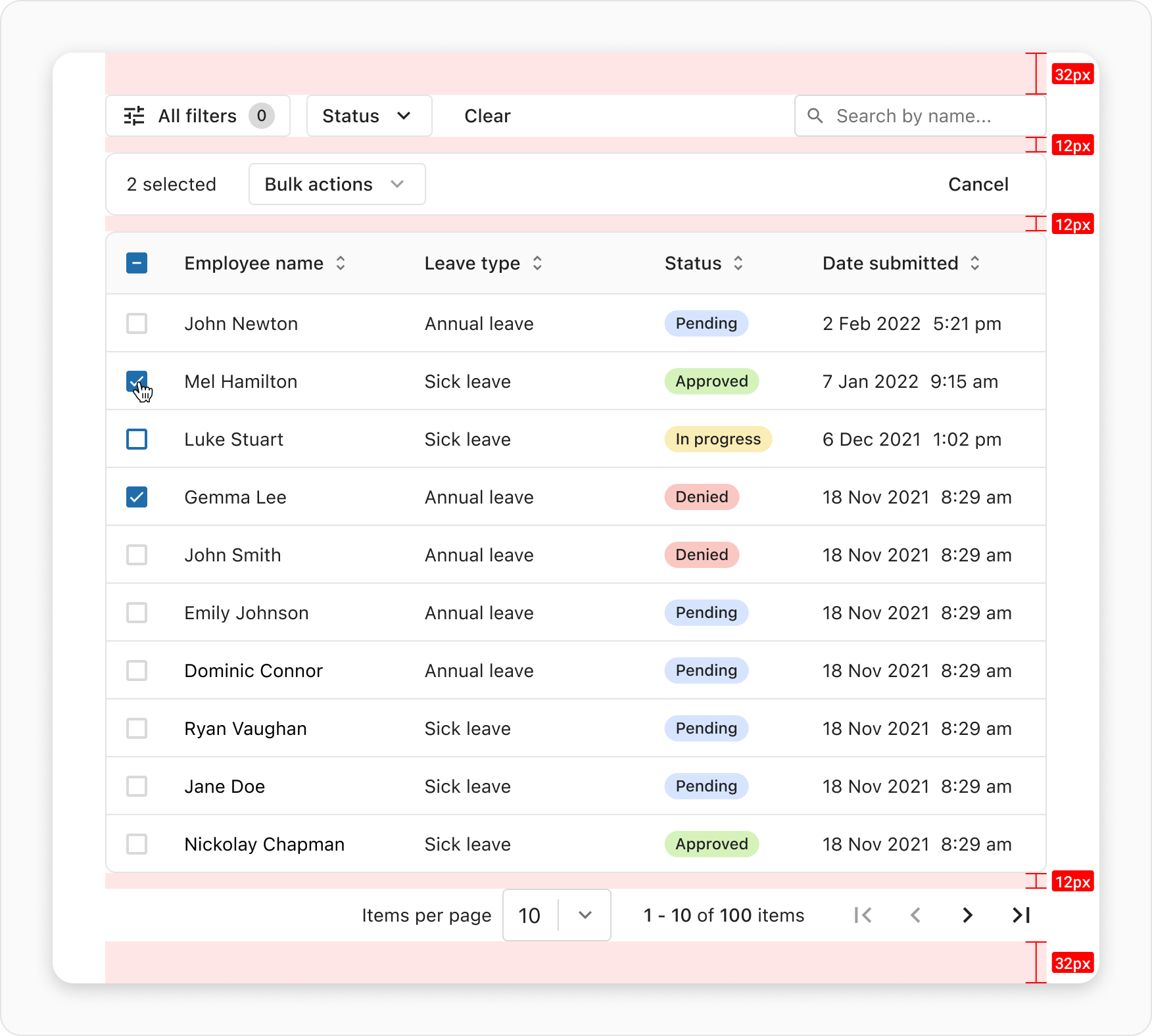
The space above and below the table group should be a minimum of 2rem/32px (xlarge space token), while the space between the filter panel, table, and pagination is set to 0.75rem/12px (small space token). These spacings ensure proper visual separation and provide a balanced layout. The ample space above and below the table group allows for a clear distinction from surrounding content, while the narrower spacing between the filter panel, table, and pagination promotes a cohesive and organized design, facilitating an optimal user experience.
The table component allows for customisation, and the extent of customisation should be determined based on the amount and type of information to be presented. Consider the specific use case and the nature of the data when deciding on the level of customisation. If the table contains extensive or complex data, providing customisation options like column visibility or reordering can enhance the user experience by allowing them to personalise the view.
Type | When to use |
|---|---|
| Column divider | It should be used to visually separate individual columns, providing clarity and improving readability. |
| Row and columns span | It should be used in specific situations where you need to merge multiple cells vertically or horizontally to represent a larger or unique data element. |
| Density | The decision to use density in a table depends on the amount and type of data you have, as well as the readability and visual design goals you want to achieve. Three types of density are available: spacious, regular, and slim, with regular being the default option. |
| Sticky header and column | It should be used when you have a large dataset that extends beyond the visible area of the table, and you want to ensure that the column headers or important columns remain visible as the user scrolls through the data. |
| Text truncate | It should be used when the content of a cell exceeds the available space, and you want to visually indicate that the text has been cut off. However, it should be used carefully to retain the essential meaning of the truncated text. Consider providing alternative ways for users to access the full content when necessary. |
| Text alignment | It should be used to positioned the text horizontally and vertically within the cells The choice of text alignment depends on the type of data being presented in the table. For example, aligning numeric values to the right and textual content to the left helps users quickly identify and compare numerical data. Default horizontal text alignment is [Left] and vertical text alignment is [Middle] |
| Table border | It should be used to establish a clear visual hierarchy and differentiate the table from other elements on the page. The border provides a distinct visual separation to the table and making it stand out. Borders provide a visual structure that helps define the boundaries of the table and its individual cells. |
The bulk actions pattern enables users to perform an action on one or more selected rows within a table. By eliminating the need for repetitive actions on each table row, this significantly enhances efficiency when wanting to apply the same change to multiple rows in one go.
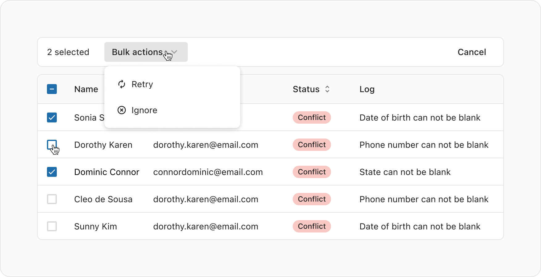
To initiate a bulk action, the user must first select the checkbox associated with the table row(s). For a detailed understanding of how this works, refer to the Selectable rows documentation.
Once a table row is selected, a Bulk action bar appears above the table. It provides the user with a count of selected rows, as well as actions they can take.
If there are multiple bulk actions available, the options are presented in an ActionsDropdown with the label "Bulk actions". If there is only one available bulk action it's presented as a neutral button with a clear and concise label describing the action.
The "Cancel" button lets the user opt out of the bulk action flow, by hiding the bulk action bar and de-selecting all selected rows.
After executing a bulk action, it's recommended to present the user with a Toast notification to communicate success or failure of the action they made.
View the Bulk actions code examples for more information.
If the bulk action is part of stepped user flow – i.e. there's only one bulk action that also takes the user to a new UI – then a bulk action bar component may not be needed.
In some cases, it might be good to ask for confirmation in a modal, or even let the user review the change in the modal before the action gets applied. This is to help with reducing the amount of accidental bulk actions.
Furthermore, it may be good to consider whether or not the application should clear all the selections after applying the action to provide a smooth UX, but this decision may vary from use case to use case.