Guide to Pendo
Guidelines for creating user friendly and visually consistent targeted messaging, feature onboarding and in-app feedback using Pendo.Pendo is a software platform that offers a comprehensive suite of tools and analytics that enable us to gather insights, track user behaviour, and drive product adoption and engagement.
ELMO mainly uses Pendo for analytics, targeted messaging, feature onboarding and in-app feedback. This guide to Pendo will focus on providing guidelines around using Pendo for targeted messaging, feature onboarding and in-app feedback.
Feature onboarding focuses on introducing and familiarising users with new features or functionalities within a product. The goal of feature onboarding is to provide users with enough information to experience the product’s value without being overwhelmed by too many unnecessary steps.
Good help and documentation are critical, but there are a number of reasons why onboarding guides, when not implemented well, could be ineffective: • Ignored by user: users prefer to start using the product immediately, rather than spending time learning how to use a specific feature • Memory strain: lengthy onboarding guides that require users to remember a lot of information can lead to frustration and cognitive overload • Increased interaction cost: onboarding can increase the overall effort required to complete a task, even if the user chooses to skip the onboarding • Limited impact on user performance: onboarding guides may not significantly improve user performance despite the time invested in creating them.
To ensure a seamless and effective onboarding process, consider the following:
Title | Description |
|---|---|
Assess the necessity of onboarding | Prioritise making the product as usable and learnable as possible. Test the product without onboarding first and make necessary improvements to the product to make it more learnable. Evaluate whether onboarding is really needed before creating one. |
Evaluate the value of each onboarding step | When creating onboarding steps, ask yourself if the step would help users achieve their goals faster, or if the steps become an inconvenience. Avoid explaining obvious information and ensure that the provided information is actionable and relevant in the given context. |
Keep onboarding concise | Aim for a shorter onboarding guide to minimise user effort. Reduce the number of clicks required to complete the onboarding. If a lot of steps are needed, consider splitting the content into separate guides. |
Make it easy to dismiss and recall the onboarding | Respect users’ time and preferences by allowing them to dismiss the onboarding, but also provide users with the option to find the information again later. |
In-app feedback (referred to as poll in Pendo) is a valuable tool for gathering insights and understanding user sentiments directly within our product.
To ensure polls are used effectively, consider the following:
Title | Description |
|---|---|
Task then ask | Allow users time to experience the system and complete key tasks before asking them for feedback. Don’t disrupt users by showing pop-up feedback requests as soon as they land on the page or during their task. Instead, wait until users have completed key tasks before asking for feedback. Ensure the request is subtle and does not obstruct important information they need to reference. Before creating a new in-app feedback, check to see whether other guides or polls are currently live for the same feature/page to avoid flooding users with multiple guides or feedback requests. |
Keep it short and focused | Design feedback surveys that have no more than 5 questions. Keep the questions relevant and specific to the context in which the user is currently engaged in to maintain their attention and allow users to provide relevant insights. |
Offer flexible feedback format | Provide clickable ratings and include open-ended questions that allow users to express their thoughts in their own words. |
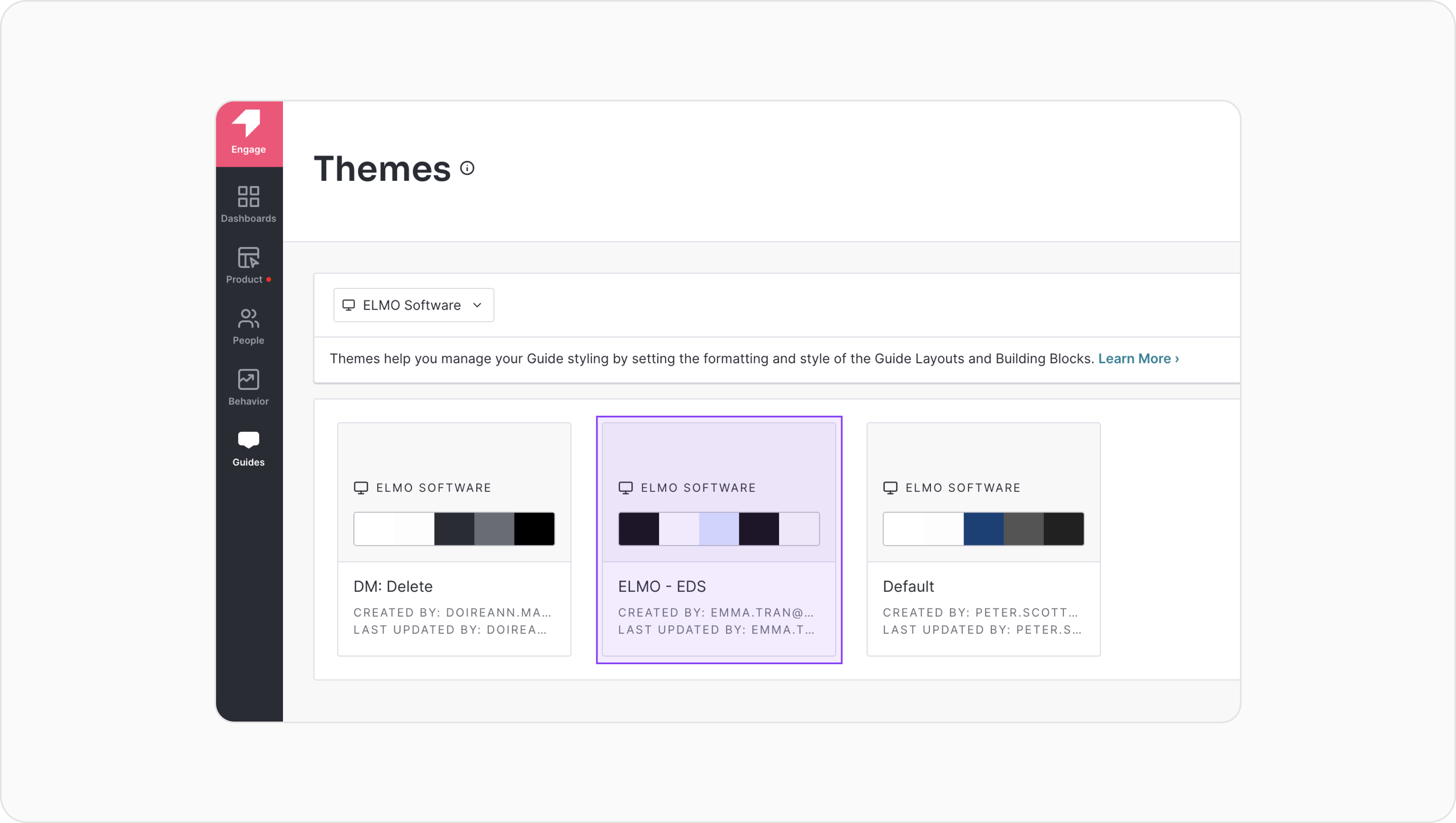
In order to maintain visual consistency, Themes and Layouts have been created in Pendo:
Themes help you manage your guide styling by setting the formatting and style of the layouts and building blocks you can use.
An ELMO - EDS theme has been created, which features an off-black (#121212) guide container background colour and light colours for typography styles, buttons and link styles and divider (horizontal line) style. This “dark theme” has been selected to ensure the targeted messaging, feature onboarding and in-app feedback content are visible and distinguishable from clients’ theme colours as well as the product’s background colour (white or light gray in most cases).
Layouts provide an easy way to keep the look and feel of our targeted messaging, feature onboarding and in-app feedback content consistently across our teams. A number of layouts have been created in Pendo to help you get started.
You can customise the layouts to suit your specific needs by removing or adding row(s) to the saved layout. When adding new rows, ensure to use the elements set out in the ELMO - EDS theme.
Lightbox layouts can be used to make general announcements or used at the start of a guide.
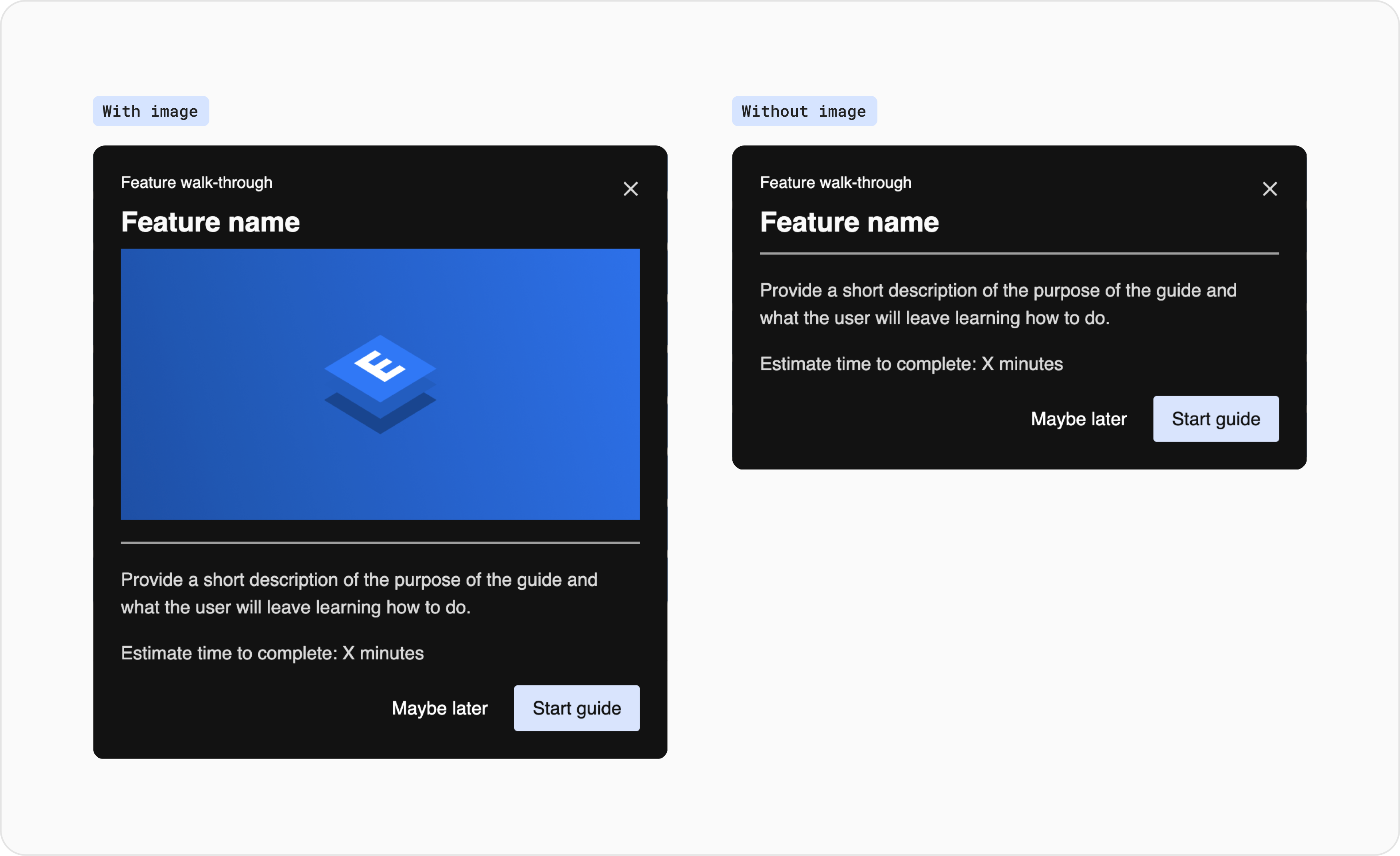
Tooltip layouts can be used to give users brief, contextual explanations of particular features.
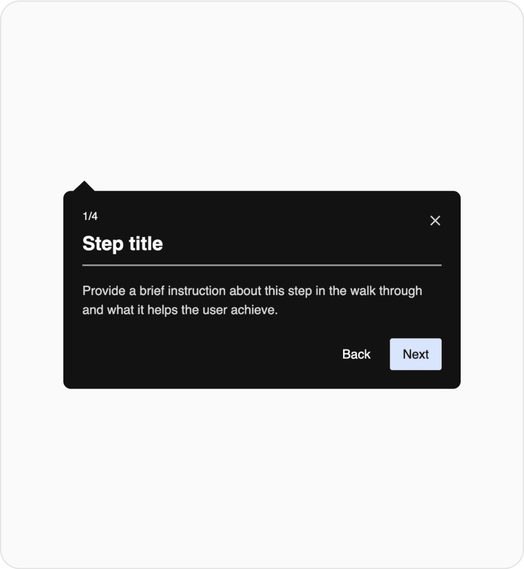
Walkthrough tooltip
This layout can be used to build one step of a multi-step onboarding guide that shows users how to complete a task or navigate around the product.
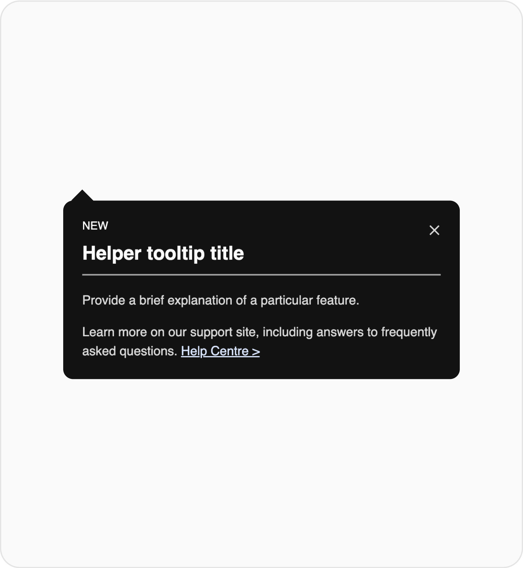
In-context helper tooltip
This layout is a simple way to explain a specific feature to users.
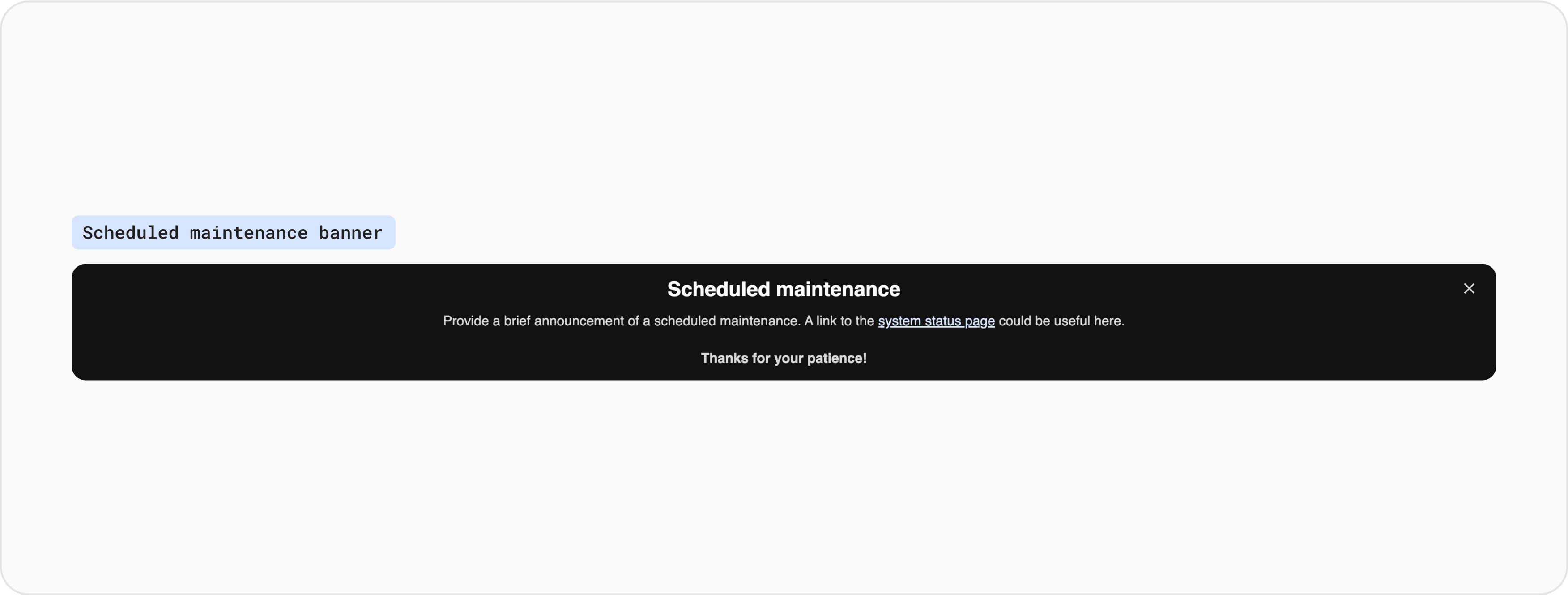
Banners are similar to lightboxes, but it appears on either the very top or bottom of a page and will span across the entire width. Banners are great for announcing an important message without obstructing a user’s entire screen.
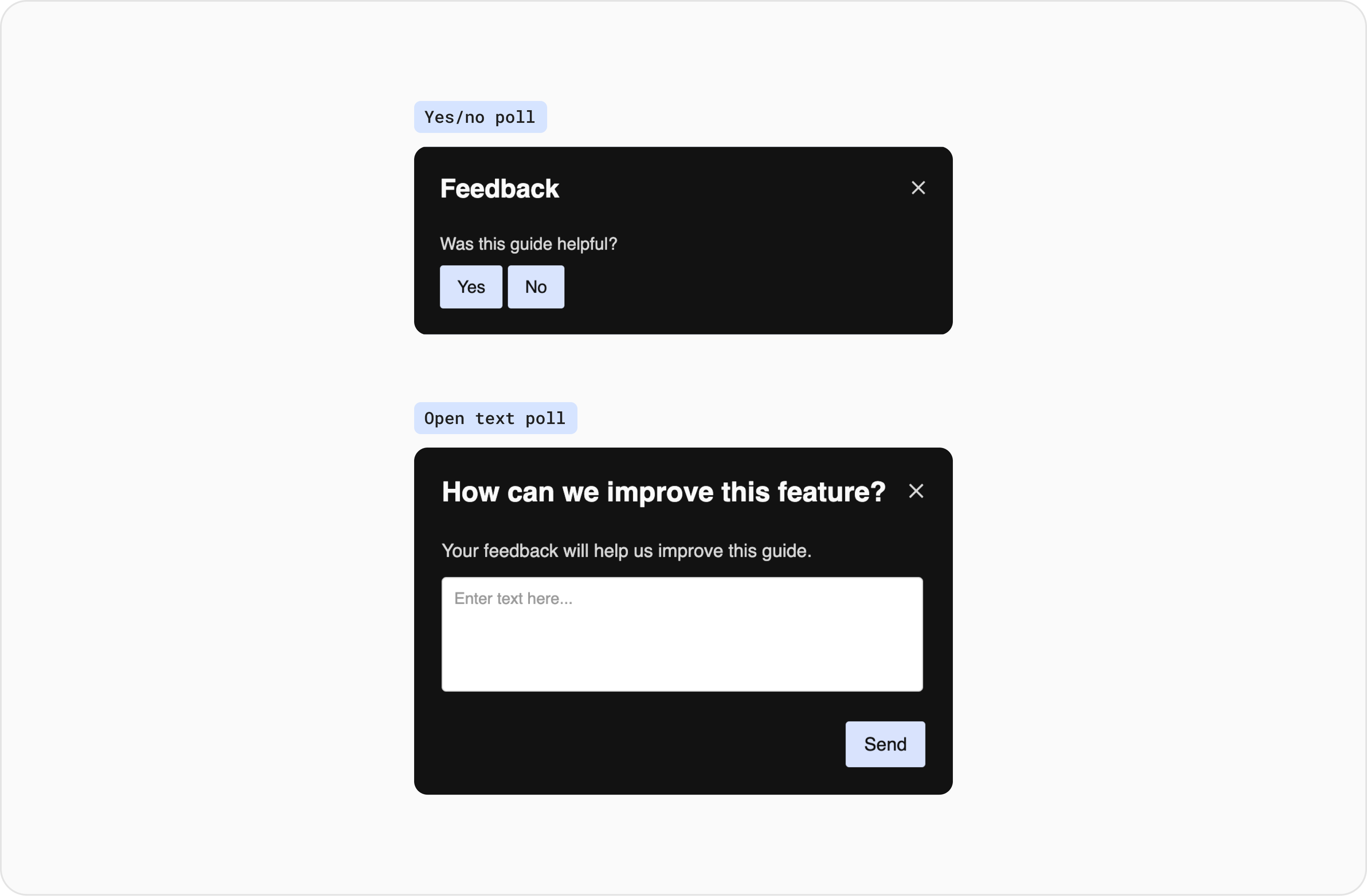
Poll(In-app feedback) can be used as part of a onboarding guide or used on its own.
Poll can be included as part of a onboarding guide, typically at the end of the guide to gather feedback on the effectiveness of the guide itself.
Yes/no poll: This layout can be used at the end of a guide to quickly survey the effectiveness of the guide. Open text poll: This layout lets users submit open-ended feedback using a text box.
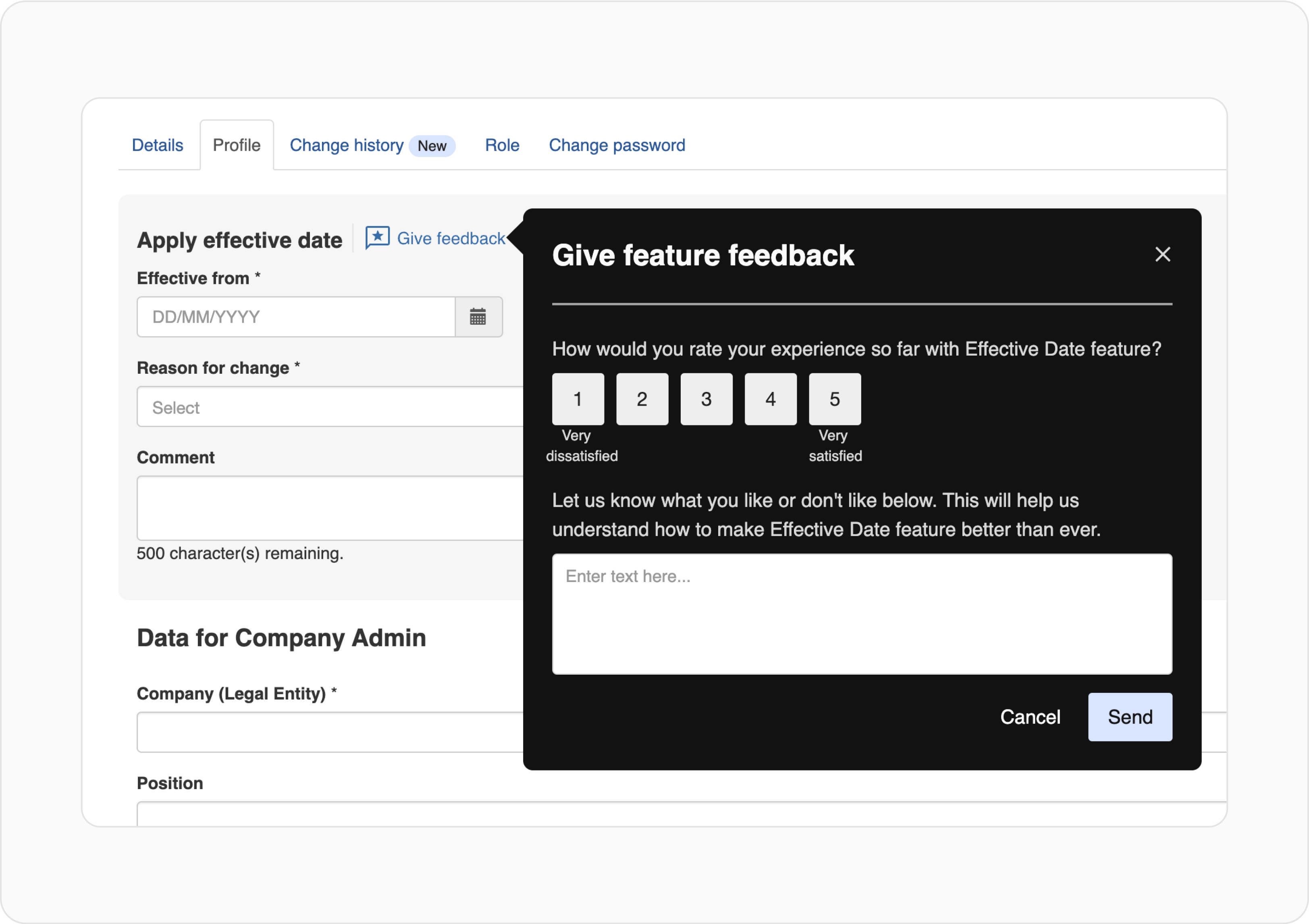
Poll can be triggered on its own without being a part of a guide. It’s recommended that the Activation mode is set to Badge (guide appears after a visitor clicks or hovers over a badge icon). The Badge Icon should be set to custom image. If you need a different badge image to the one below, please contact the Design team.
The standalone poll can be customised to include less or more questions (recommended to have no more than 5 questions).
Badge Icon: The custom image can be downloaded from here as an SVG file and then uploaded to Pendo Designer > Activation Settings > Badge (switched on) > Edit Settings > Styling > Change Image.
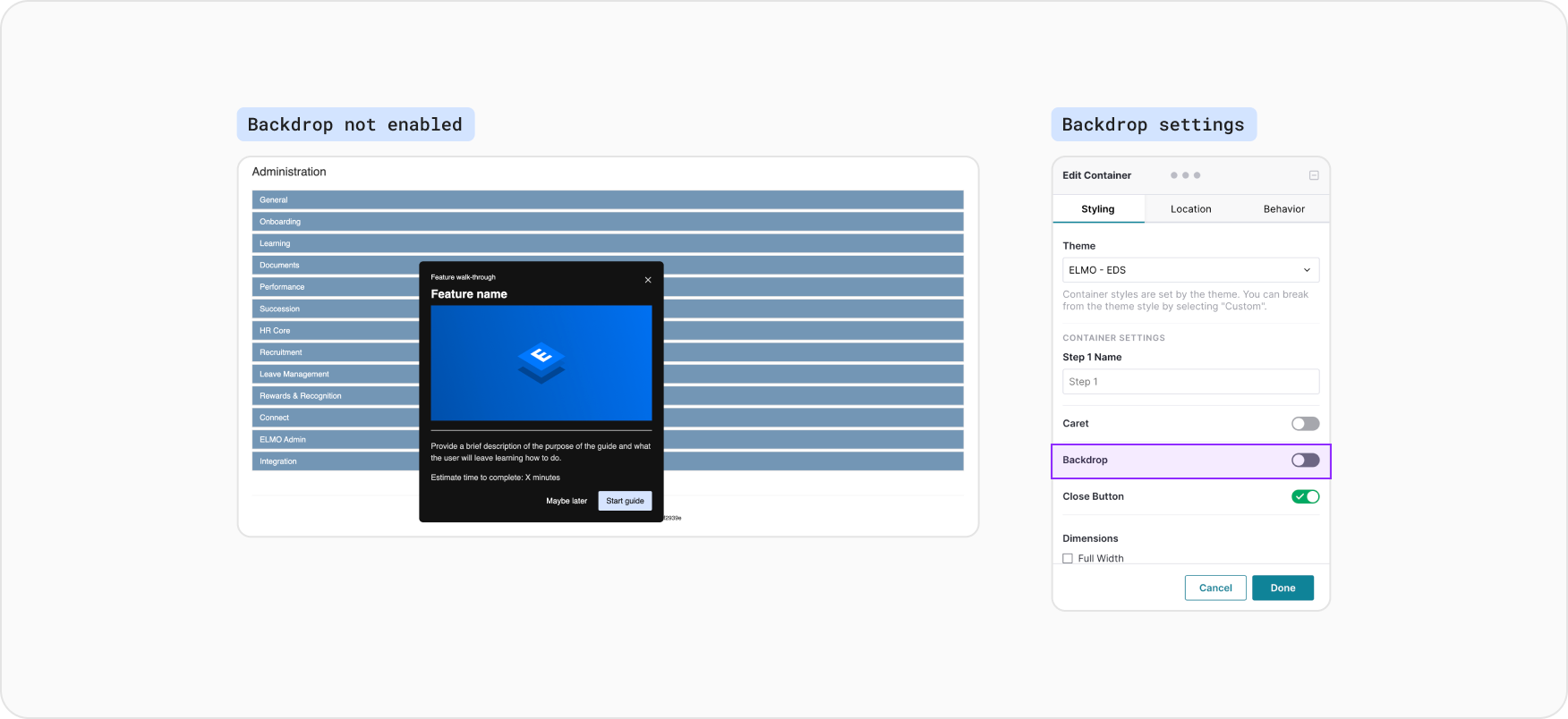
The backdrop function in Pendo narrows the user’s focus to a particular element on the screen.
When using lightbox, banner and poll layouts, it’s not recommended enabling backdrop. This is because the guide container background colour (#121212) has been selected to allow the guide to stand out on ELMO application screens that have predominantly white, grey and client’s theming colours. In most cases, showing the guide on top of the screen, without enabling backdrop, helps users better understand the content of the guide within the context of the product.
When using tooltip layout to point users specifically to an element on screen, to prompt users to view and/or to interact with the element, backdrop can be enabled to help users accurately select the element.
In a multi-step guide, backdrop can be enabled in some steps and not other steps. This can be controlled within the individual step’s settings.

In order to ensure consistency, we are currently in the beginning stages of establishing a process for creating, reviewing and deploying Pendo guides across the organisation.
Keep guides organised and searchable by having consistent naming convention:
[Theme] | [Topic] | [Segment] - {Activation}
Guide | Effective Date - Profile | Admin + HR Manager - Automatic
Feedback | Effective Date - Profile | Admin + HR Manager - Badge icon
Alert | Recruitment | Everyone - Automatic
Users from different teams from across the organisation are empowered to create their guides in draft, following this guideline around layout and use case.
The drafted guide can then be submitted to the ELMO Pendo governance team for approval.
The ELMO Pendo governance team, which consists of members from Product, Design, Marketing and Implementation, aims to meet once a month to discuss Pendo governance and audit the guides that are live, in order to ensure that users aren’t being over-communicated with.